SKX Creations [V2]

Exoskeleton

Pale Flesh
Veteran
Joined
Apr 5, 2009
Messages
3,389
Age
33
Location
Locked Away
Gil
9
My old thread is far from salvation and I've been improving in my work so I decided to start over in a fresh new thread! ^_^ So now here are some new works sorted by most recent to oldest.

Feel Free to ask for a siggy at any time ^_^. I'll also let you use the ones I've made as long as you credit me in your sig :3.

Vivi.png

SKX-1.png

Elfen.png

Tifadrawn.png

Bubbly.png

Yoona.png

Scorned.png

Jun.png

catboy.png

lightning3.png

Beauty.png

Gunblade.png

Littlered.png

Squall.png

vampknight-1.png

Lili-1.png
Lili.png

puppy.png

gunfinished.png

cynic.png

Sweeny.png
Sweeny-1.png

Lovett.png
Lovett-1.png

Johanna-1.png
Johanna2.png

Johanna.png

model.png

Yaosi.png

Rinoa.png

Haruko-1.png
Haruko.png

Artthing.png

stella2.png
Stella-2.png
Stella-1.png

noctis.png

yuno.png

Uncharted-1.png
Uncharted.png

Disney.png

versus2.png

versus1.png

versusavi.png
Stella.png

noctavi.png
Noct.png

gofsig2.png

musicsig4.png

Reiavi.png
Rei.png

Vanille2.png


So how am I doin? :yay:
 
Last edited:
Noct.png


Actually LOVE this one!

I love the text. and the swirls, and the colours blend perfectly together, and the border finishes it off nicely.

The only bit that bothers me is the far left, the black part could probably do with a bit of smudging or blending of some kind, but other than that this tag is my fave from you. ^^
 
Rei.png


This one is like. (y)

I like it because it looks very neat and the coloring is done well. The piece is simple and gets its point across. It's very vibrant and the effects are very spot on! The text is very good and the stock used fits in the canvas very well. Overall, this piece looks very good to me. :awesome:
 

Rei.png


Okay, first off, this one is freakin' awesome man. Though, that border, has got to go. It looks too out place and doesn't really match the sig itself. Maybe if you skinned down the sides of the border, it will look better. Furthermore, the color is brilliant, the image could use a bit of toning down in brightness, but it's still great.


Uncharted.png


This one looks mushed in. But other than that, the color is good, but the brightness once again could use a bit of toning down. The text is exceptional, and the placement could not get any better.


yuno.png


Last but not least. This one is my favorite one so far. Though, the color scheme doesn't match at all. She grabs all the attention, which is good, but against the fiery background, she doesn't even look like she belongs in such an environment.

I think you just need to not overdo it on the brightness. Because most of your tags are just a tad bright.


Okay so I finally have a few sigs to update with. I also have decided to allow anyone to use my sigs as long as they credit me of course as Oliskx ^_^ Anyway here I've got a callout piece which was in a tie with another until I voted for the other one XD Haha so much for being nice! jk :P 
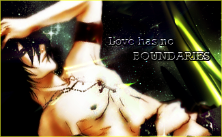
The others are of noctis/stella and a nice work of art that I found.

Artthing.png

Stella-2.png
smaller:
stella2.png

Stella-1.png

noctis.png

musicsig2.png
 
Last edited:
Your latest post is a big improvement on your previous stuff. Looks like your really getting the hang of creating focal points and working with c4d and effects. Kiu ;)
 

I love this one, although I'm not sure if it's supposed to be an avatar or a miniature horizontal tag? :lew: Unusual proportions for an avatar, but, it's still really pretty. Bit unsure on the border though, it doesn't really go well. I love the lighting and the colours though, they're really pretty.


I'm liking the colours and the lighting here, although, be way of Floating Head Syndrome. Maybe showing her shoulders would help with placement. Again, not so sure on the white/opaque border, maybe a black one would work better. Whilst the text is nice, it doesn't flow very well, just being shoved in the corner. Moving it nearer to Stella would help that. ^^ I'm loving the positioning of the C4Ds though, it's really effective, and the line going between the two borders is a quirky touch, and I really like it.
 
Thanks everyone for the comments ^o^ I finally got some new stuff done over the weekend and yesterday as I was bored to bits. XD

Here's a Fooly Cooly Set with Haruko as the main focus
Haruko-1.png
Haruko.png


Also made this Rinoa one but when I tried to figure out where to place text I just couldn't find where I would be able to place it O__O So in the end I just scrapped the text. XD I hope it still looks good to you guys though...
Rinoa.png


Here's another I did:
Yaosi.png


And a final one which I used a model-ish lady for. I don't think I normally do too good with images of actual people in a sig. This is actually the best I've ever done so I'm proud of it :3
model.png


Oh and I forgot this one for a callout I did:
Disney.png
 
I think you need try and pick up some basic graphic design principles of hierarchy and contrast. Your work is good but I think you should focus on typography (lettering). It's a subtle thing that will surely make your work a lot stonger. I particularly like the typography in the "Music is everywhere" one. You should try enlarging the "music" so that it justifies with the "is everywhere" line below.

keep it up.
 

model.png

Yaosi.png

Rinoa.png

Haruko-1.png
Haruko.png

Artthing.png

stella2.png
Stella-2.png
Stella-1.png

noctis.png

yuno.png

Uncharted-1.png
Uncharted.png

Disney.png

versus2.png

versus1.png

versusavi.png
Stella.png

noctavi.png
Noct.png

musicsig4.png

Reiavi.png
Rei.png

Vanille2.png

I'll try critiquing some pieces not because I think I'm a better artist, because you're a thousand levels ahead of me, but because I enjoy giving input on art:

Going from top to bottom:

1. The lighting makes her look a little too soft. Soft is usually good but I think a little less would create a more human look.

2. It's alright. Definitely cool. However the focus point seems to blend in with the background a tad too much.

3. I like it very much.

4/5. The avatar is cool if you're into the plain look. The sig is definitely nice, however the guitar looks a bit unrealistic/ out of place in comparison to the rest of the piece. Some sort of blending/depth alteration could probably fix this.

6. Love it.

7/8/9 Stella. Good.

10. The detail is great. However given the piece, I feel like the lighting could have been better in some areas.

11. Good piece.

12/13 Uncharted. Not a huge fan of the avatar because there's a little too much blur. The sig however is very realistic, at least the portion of it that looks to be a render.

14. Good.

15. Like it. Not sure how much I like the border though. I guess it fits the piece.

16. Well, it's different.

17/18. Love it.

19/20. Like the avatar. However I consider it to be a little better quality than the sig.

21. Like it. Great text.

22/23. I'm not a huge fan of the stretched effect that the avatar seems to have. However I think the sig is good.

24. The experimental background/foreground is a bit subjective. Might have been better without the foreground pixels getting so much in the way of Vanille.
 
Last edited:
model.png


I REALLY like this one!

I like the text and the background, it's really good how you've done it. (Did you use a C4D background and then put a swiss layer of white on top? Very well done!)

The placement of everything is spot on aswell, this is your best piece in my opinion, good job :awesome:
 
So I've recently been in a Sweeny Todd mood as I just watched the movie and got in the groove. I'm pretty much all grooved out XD I might go check other graphic threads to get some new inspiration for GFXin ^^

The Sweeny sig is decent for me I think. Nothing too special...I think there was something missing with the sig. I like the Avi because I got this effect going that makes it look like pieces are peeling off of him like he's an old painting ^^

Sweeny.png
Sweeny-1.png


This is a Ms Lovett set I made. I don't like how the Avi turned out but the sig worked out in a way that I was thoroughly satisfied with. I think the white border and text would blend better into the sig with opacity :/

Lovett.png
Lovett-1.png


This is a Johanna combo This one took a while but I'm satisfied with the sig despite it's large size ^^. The Avis didn't have too much going on but I like them still ^^:
Johanna-1.png
Johanna2.png

Johanna.png


Time to look for other inspiration ^o^
 
I very much like the style of the pieces. The style is different than anything I have seen from you so far. With a little more practice, I think you'll become even better at it.
 
Made a set based off Lili from Tekken
Lili-1.png
Lili.png


I loved this puppy pic so much I decided to add color to the black and whit photo. I'm so proud because I never added color to a black and white photo before!!!
puppy.png


This looks terrible but I tried xD
gunfinished.png


I was playing around with this image. Nothing too serious.
cynic.png
 
puppy.png


OMG this one is soooo cute! :inlove:

I like the lighting aroung the sig, and the border is nice too, other than the cuteness there isn't much going on, but for this tag it doesn't bother me because that puppy/dog is soooo gorgeous! I wouldn't want any attention taken away from it!

You have yourself a fan here :mokken:
 
Thank you Kandy ^^

I got a whole new batch made. I think I'm starting to get a bit of a distinctive style I guess. There's a lot of stuff I'm constantly learning to do though. I just learned about 3D shapes.

Vivi.png

SKX-1.png

Elfen.png

Tifadrawn.png

Bubbly.png

Yoona.png
 
Back
Top