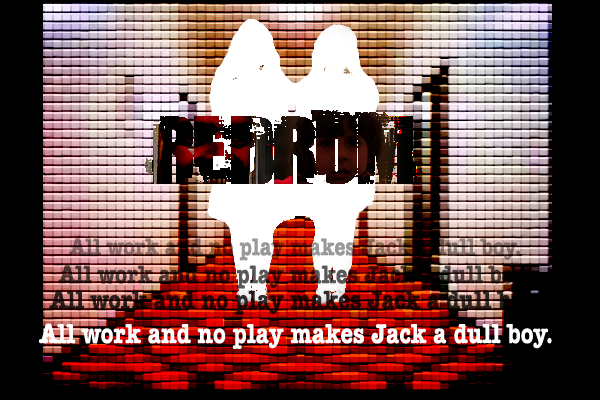
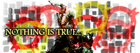
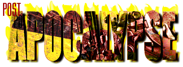
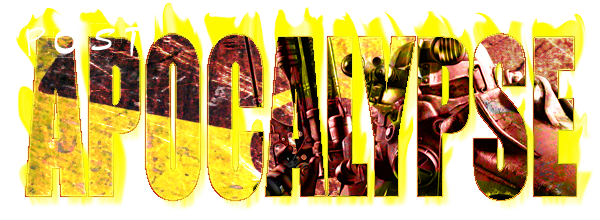
Yeah, couldn't think of a better title here...
 (Note that this sig is supposed to be best viewed with 3-D glasses. The ones with the different coloured lenses, not the ones you get in cinema these days.)

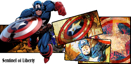
I used to do so much graphical stuff, but I haven't been into it for a few years. That Captain America one I made was the first in a very long time. I think I do have a thread here somewhere with loads of my older stuff, so I'll link that here when I get 'round to digging it up. I may have some other old stuff that I've never posted, so I'll eventually get 'round to that too.
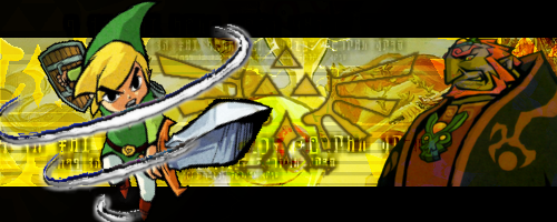
Anyhow, I'm working on some more stuff as we speak.") I was quite happy with my Sonic and Shadow 3-D sig, so that's definitely something I'm going to explore further. So yeah, have at them. Be honest and tell me what you think. What works? What doesn't work? What could I improve on?
I was quite happy with my Sonic and Shadow 3-D sig, so that's definitely something I'm going to explore further. So yeah, have at them. Be honest and tell me what you think. What works? What doesn't work? What could I improve on?
I used to do so much graphical stuff, but I haven't been into it for a few years. That Captain America one I made was the first in a very long time. I think I do have a thread here somewhere with loads of my older stuff, so I'll link that here when I get 'round to digging it up. I may have some other old stuff that I've never posted, so I'll eventually get 'round to that too.
Anyhow, I'm working on some more stuff as we speak.
I was quite happy with my Sonic and Shadow 3-D sig, so that's definitely something I'm going to explore further. So yeah, have at them. Be honest and tell me what you think. What works? What doesn't work? What could I improve on?


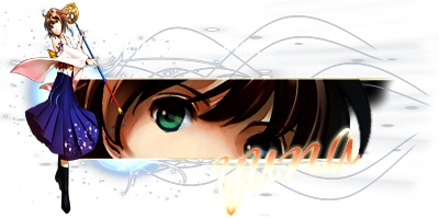
 I'm liking it but a few problems, firstly, the lighting near the second render (I think it yuna hugging tidus) is far too bright, turning the opacity down should help, the render on the left, I feel that their not a need for it, the focus point I feel should of have been the second image not the one right in the left, it feels like it just thrown in and kinda ruins it a bit, it don't help that there no lightning or blending for that render, I think taking that render out would make it much better. getting rid of that render will also allow you to move the text over, as I think the text is slightly too fat to the right, move it o the left and down a bit would help, as it overlaps the render, which disacts me from the focus point


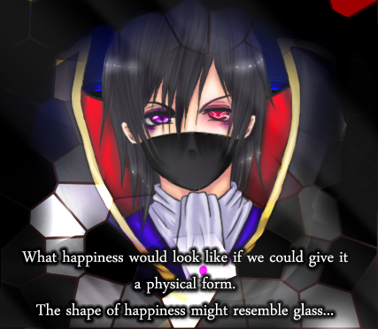

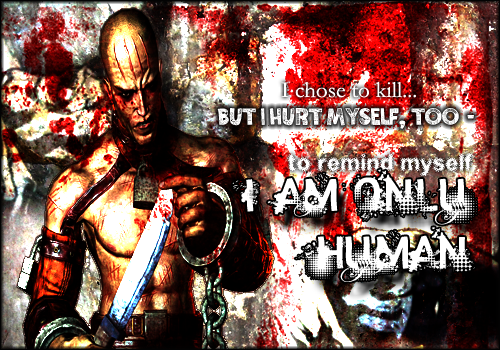
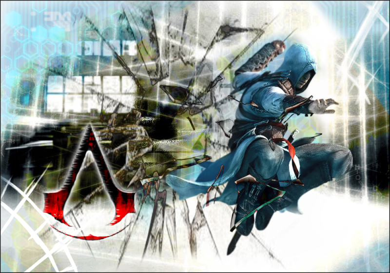
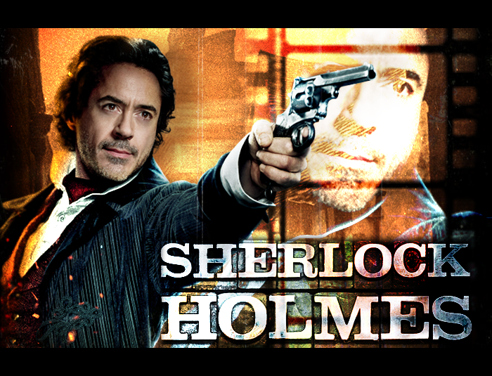
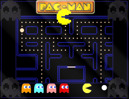
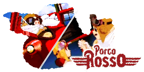
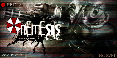
 I keep trying out new things, but never feel like it's any better than my previous stuff. Moar feedback would be great!