No Me Gusta GFX - Cali's not so wonderful junk in the trunk

The Witch

I myself am strange and unusual
Veteran
Joined
Oct 30, 2008
Messages
7,248
Gil
1
Rinoa Heartilly
Squall Leonhart
Tifa Lockhart
Jenova
Moogle
Cactuar
I'm making this because I want a new thread... one that doesn't have my old disgusting excuses I called "gfx" :grin:

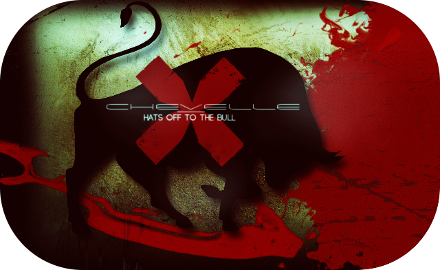
Anyway, first one up is a forum banner I made for a friend: I used this image.

clerith2_finished.png


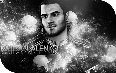
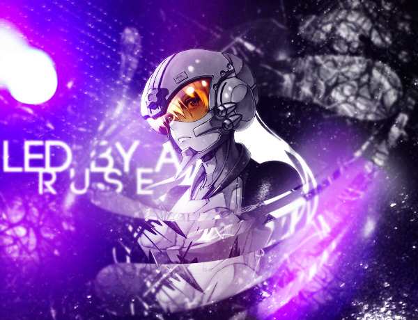
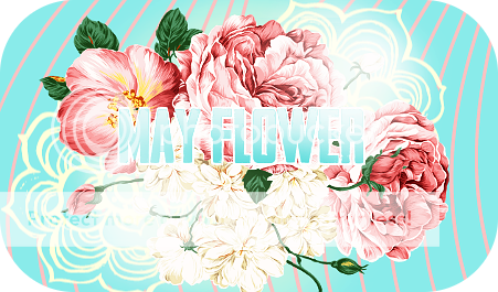
And here are some sigs I made that I wouldn't mind feedback for.
kaidan_alenko_signature_by_californiababewv-d4v9d5q.png


kaidan_alenko_by_californiababewv-d4v9cws.png


cc21_BIG.png


Toni_Ziggy_Stardust_V3.png


Toni_Ziggy_Stardust_V6.png


Ari_Black_n_White_round-1.png


Conor_s_sig_BnW_roundedge2-3.png


HOTTB_3.png


Aloha_3-1.png


Aloha_5.png


Cali_icon.png
<--an icon :hmmm:

deusex_conor_sig1.png


deusex_conor_sig5-1.png


deusex_conor_sig2.png


yeah... that's all. :hmmm:
 
Aloha_3-1.png


Aloha_5.png


These two are my favs!! I love them :rage:
The patterns behind the text look so nice and I just love the colours you've used.

The orange one is my fav though because orange is my favourite colour and it just really reminds me of like hawaii or a nice little tropical island or something.
It's really bright and cheery and I love that!

Obviously I also really love the Ziggy Stardust one you made me too /smug. It's beautiful!

:ari:
 
All of your work is great for the most part so I am not really sure what is happening to be honest. That cali icon is pretty amazing, and I really like the aloha sig (the grey one, I do not like the orange one)! Also, do you have my Marina and the diamonds set about anywhere?
 
These two are my favs!! I love them :rage:
The patterns behind the text look so nice and I just love the colours you've used.

The orange one is my fav though because orange is my favourite colour and it just really reminds me of like hawaii or a nice little tropical island or something.
It's really bright and cheery and I love that!

Obviously I also really love the Ziggy Stardust one you made me too /smug. It's beautiful!

:ari:
Thank you toni :ari:

I'm happy to hear I conveyed the Hawaiian vibe good (I was nervous that people would think the hawaii thing didn't match :gonk: ) also i am very pleased to hear that it's cheery to you... that was also something I aimed for. :inlove:

You are so kind. :ryan:

Also, orange is a fav color of mine as well :grin:

All of your work is great for the most part so I am not really sure what is happening to be honest. That cali icon is pretty amazing, and I really like the aloha sig (the grey one, I do not like the orange one)! Also, do you have my Marina and the diamonds set about anywhere?
Thank you pal! I actually liked the icon as well :lew: so I'm happy someone else does too!

And which sig? This one:
C_request_icon6.png


C_request6.png


C_request5.png


C_request_icon5.png


C_request_icon4.png

If so, I do not think they look decent anymore. :hmmm: They have reached their expiration date and have now soured. :wacky:
 
Annnnnnd what about this I made from brushes and stuff :hmmm:

May_round.png


feedback is nice :inlove:
 
Fucking hell. Those are good.

I love the Deus Ex tags, they look as good as the tags I used to download to learn from.

Really awesome stuff Cali, I hope you post more of them.
 
Annnnnnd what about this I made from brushes and stuff :hmmm:

May_round.png


feedback is nice :inlove:

i swear to god if you bash your work again i'm gonna commit 9582958495349845 sins and then kill you becauSe WTF this is perfect

also i'm taking this why didn't you show me it!!!

Ari_Black_n_White_round-1.png
 
Fucking hell. Those are good.

I love the Deus Ex tags, they look as good as the tags I used to download to learn from.

Really awesome stuff Cali, I hope you post more of them.
Oh mah god :gonk:

*faints*

Thank you Ewan. That is so lovely of you to say. I appreciate it so much. :ryan: You've always been my GFX muse so I'm stoked for you to think so highly of my stuff. :ari:

i swear to god if you bash your work again i'm gonna commit 9582958495349845 sins and then kill you becauSe WTF this is perfect
Well, nine quadrillion, five hundred eighty-two trillion, nine hundred fifty-eight billion, four hundred ninety-five million, three hundred forty-nine thousand, eight hundred forty-five is a lot of sins... & I definitely don't want you to sin. :mokken:

Thank you, though Ari. you are so kind. I really appreciate your feedback so much. :ari:


also i'm taking this why didn't you show me it!!!

Ari_Black_n_White_round-1.png
I didn't show you it because someone that gave me feedback for it said the black swirly lines in the background looked like "pubic hair"... so I was ashamed. :okay:
 
Ugh, give me some HELPFUL feedback, please.

I think his face is too pale but I had no idea how to make the bloody thing bright without looking too... sharp. (and I didnt use sharpen :wacky: )

loki-19.png


that said, i still like it tbh. I just know it could have some touch ups... any advice?
 
loki-19.png


....:rage: I don't even like Loki but this piece is fucking awesome!
I love the text the most and the emerald green colours used. Ughh it's just soo gooood. Cali ilu :cali:
 
At least I know its not just my monitor messing it up (although all lighting looks like crud on my gfx comp so I shoot in the dark pretty much). :lew: I'm looking up ways to avoid having this sharpened look when I don't sharpen... not having any luck. :hmmm: Anyway, thank you for commenting. :ryan: at least you didn't get back with "the font should be bigger" :wacky:

I say if this is the only prob I am lucky. :lew: thanks again pal.

....
2nu5o8.png
I don't even like Loki but this piece is fucking awesome!
I love the text the most and the emerald green colours used. Ughh it's just soo gooood. Cali ilu
cali.gif
Thank you toni :ari: you are just too nice tho :ari:

I'm happy you liked the text though. It ruined the piece for others supposedly. :wacky:
 
I think this sig is really pretty! I just think you need tow work on the lighting a little more. It seems really intense on your render and then kinda dull on the effects on top. It kinda takes away from the 'blending' and looks like he's been slapped in rather than a part of the picture...if u know what I mean. try experimenting a little more with burn/dodge tools and this should turn out great! :) I don't know which version I like more...they both look good. :)

Sorry if I sounded harsh...
 
Ugh, give me some HELPFUL feedback, please.

I think his face is too pale but I had no idea how to make the bloody thing bright without looking too... sharp. (and I didnt use sharpen :wacky: )

loki-19.png


that said, i still like it tbh. I just know it could have some touch ups... any advice?

The colors you got here are surprisingly amazing. Effects look good, and even though it's centered(rule-of-thirds), it works. You got him blended, but I think the problem lies in the text and contrast. The contrast just is a little too much or maybe that's just me. The top part of the text sticks out like a sore thumb. i think it needs a more green-ish tone and not the light cyan you have there. nicely done, though. (y)
 
gfx dump of previous requests I made

Taylor_Thor_sig2.png


Taylor_Thor_sig.png


Kellys_Request-6.png


Conor_sig-3.png


Bubblegum.png


Robert_DJ_bnw-1.png


SexyBeast_V1-3.png


comments and stuff are appreciated :ari:
 
I think the Thor tag is stunning. Awesome level of detail and the blurring adds a lot of depth and makes it more interesting to look at as it has a3D element to it. Very cool text as well, again, it has a 3D element to it.

Very nice Calisaur, very very nice. (y)
 
I think the Thor tag is stunning. Awesome level of detail and the blurring adds a lot of depth and makes it more interesting to look at as it has a3D element to it. Very cool text as well, again, it has a 3D element to it.

Very nice Calisaur, very very nice. (y)

Thanks so much ewan :gonk: like always, hearing you say that is insanely awesome for me :ohoho: thanks again :ari:

anyways, i made a wallpaper for the chevelle album. :hmmm: i'm not too good at wallpapers but eh, i'd use this :lew:

I tried to make it look like a fuller image of this picture. Obviously it's not a close up of a bull but I didn't want it exactly like the original. I tried to recreate the red cape by using some red blood/paint splatters. I made the bull out of a bull image and rendered it myself. To (attempt to) add depth and curve to the bull I used lens distortion to make the bull look like its body is half turned. I then added a depth shadow and did a white glow on the edge to make the bull look a lil more dimensional. :/ I also tried to make the background look like the dirt floor of the arenas where bullfighting happens. The font I decided I wanted to (try) and make it look like it was caught in motion, so I used motion blur on the entire image and erased parts that I thought looked best, leaving segments of the image with the motion blur to give off a "caught in motion" vibe that the original picture has. It's also my first time doing something bizarre like that to the font (turning it side ways and placing the words randomly).

So yeah. :wacky:

comments and feedback are always helpful. ^_^

257g9zl.jpg
 
Back
Top