Kellys GFX attempts

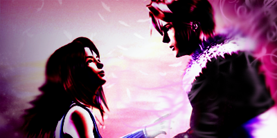
squallrinoacopy.png


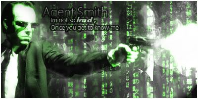
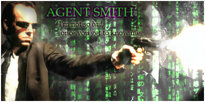
AgentSmithsigcopy.png


OMG Kels from beginning this 3 weeks ago you are turning into one helluva GFX artist. These 2 are sooooo awesome looking, I am not an expert in any sort but I would have to say these two are....perfect. They both work great with the pics and Agent Smith one is epic (I really like that one, just watched the Matrix last night. :D) Keep em coming like this and you will be part of one the GFX groups in no time. :D
 
KellysAgentSmith-1.jpg


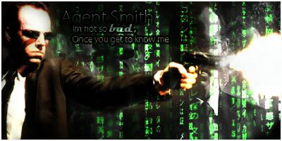
KellysAgentSmith2.jpg


Finally added some text and got a border in there too, course I had to have help xD

Faffed with the colours abit as well
 
Hey, that looks pretty cool. But I think I prefer the second one better, the green thing doesn't look right. The text looks great, but I suggest you play around with fonts a bit more. It also looks awesome with a border =)

Nice job keep up the good work! =)
 

I like this version more, because it has more colour in it!

It comes across as a bit more realistic than the green version.

The blending around him was done pretty good and the lighting is well directed.

The background looks a bit sketchy. I would suggest blurring it a tad.

The font used looks good but I would suggest taking away the black stroke as it tends to blend into the background a bit. It looks good still, but personally I would use a white stroke to make it a bit easier to read.

Other than that you've done a good job at this one!

The border rounds it off nicely too!
 
Cheers for the comments, there's so many freaking layers on that one, I don't half fanny about :gonk: I might have another fiddle with it, just knowing my luck I'l ruin it, unles I start again and see if I can make it any better at some point :hmmm:

Anyway, new one, not that I've even DONE much on it. Just trying to make it sink in with how to fiddle with text and borders and that. I rotated the image (Ive already forgot how I did that <_<) and that's about all I've done... 8F

Oh, the lighting as well.... xD

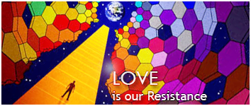
resistance2.png

Not sure what happened with ''our'' there either. Text is clearly the bane of my life -_-

00026211.jpg
 
resistance2.png


:D I actually like the text on this one. The colours are great, and the text isn't too badly placed at all. xD I think placing them, maybe, a bit closer to each other will make them have that "click" a bit more though. :D

You've been really improving since your first signature, so that's definitely a great improvement on text as well. :D

Keep it up, Kelly. :D
 
I'm not sure what Ive done to that, considering it only has like a couple of layers, trying to edit the text isnt working, I deleted the is our resistance bit (so I could retype it and make it closer) and like, there was still faint text there where Id deleted it :gasp:

Anyway, Ive fiddled with the Agent Smith one abit more, though only really the text

AgentSmithsig2copy.png


Not got a shitting clue what that random bit of npink behind Smith is all about though.....
 
AgentSmithsig2copy.png


I've gotten random colors appear when I've messed around with things. Usually working with Curves and such. the text looks great, Kel. I can see your improvement greatly. I also quite like the faded pics in the background. Smashing job. :grin:

resistance2.png


This one's pretty 8F I really like it. Not too busy, as most pieces with so many colors tend to get. This one is just right all around.
 
Back
Top