I did, and Il try...
WHY WON'T IT WORK?
I'm SURE I did this on Lews tutorial with erasing shit...but I can't get it to work
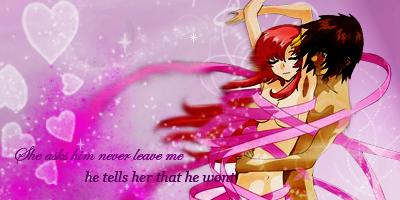
Right, I've done it, I was just having another blond moment, I took some off his face as well, he looked weird after I done hers so...
WHY WON'T IT WORK?
I'm SURE I did this on Lews tutorial with erasing shit...but I can't get it to work
Right, I've done it, I was just having another blond moment, I took some off his face as well, he looked weird after I done hers so...
 How much do you improve in such a short space of time?
 I can't wait to see more!
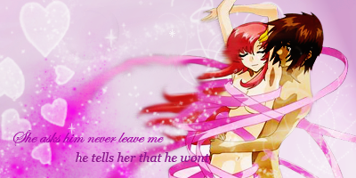
 This is awesome
  The Text is kinda hard to see on the left due to the smudging,and the girl is blended in a little too much on the left, but other than that, this is epic win
 ")

 I forgot to save it as well, so I can't edit it to get the text off her face
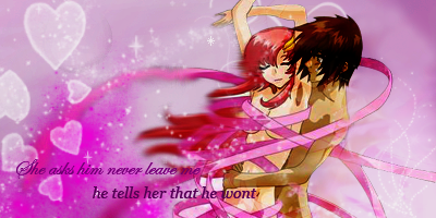

 Im not very good with the blurry/delety stuff, but I'l get the hang of it eventually...along with a better mouse
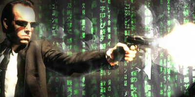
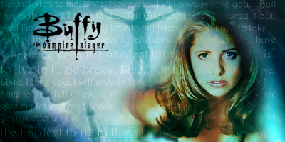
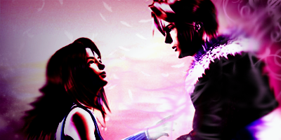
 I LOVE the Squall and Rinoa one! Keep up the awesome work!