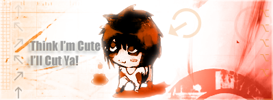
I'm not sure which one looks better. The softer looking one or the darker one?

That one's the better one in my opinion. The other one looks too brash and some of the colors don't really look good. This one is really prettily made ^^
Follow along with the video below to see how to install our site as a web app on your home screen.
Note: This feature may not be available in some browsers.
I'm not sure which one looks better. The softer looking one or the darker one?
Hiiiiiiii!
Another update again!
I'm not sure which one looks better. The softer looking one or the darker one?

My entry for AOTW 38: Theme FFX-2 - Didn't win XD


 Your Yuna and Tidus avvy is drop dead goregous. ^^


") your good at them, so keep practising.
your good at them, so keep practising.

 you really should enter more often. You must have a few aotw wins under ur belt aswell now, u have to give me tips on making them someday. =)