Cid's Newbie Graphics

I really like your work.
brahnesigver2new.png

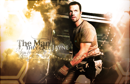
This is really nice. For me I like sigs with color, I'm not a huge fan of neutral toned sigs. But I really like this. The mix of the pink with the orangey glow is quite warm and fits. Love the glow on his...horn thingies.

I would love for you to make me a sig sometime :grin:

Thanks! I would love to make a sig for you too :grin:
Just ask away, in my graphics shop if you want to.
 
Update!
cidsig.png


cidavatar.png


Comments are always appreciated!
 
Last edited:
Update!
cidsig.png


cidavatar.png


Comments are always appreciated!

that signature really nice great lighting as always from you.... the text is just right... i'm not too keen on putting text where the render is but that just me :wacky: and nice effects great work
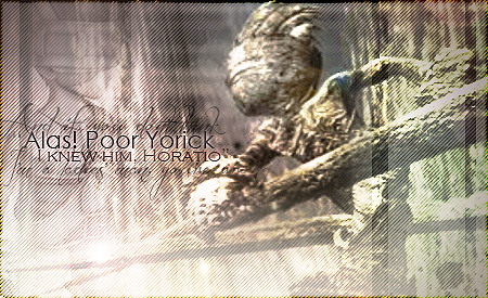
 :yay:
 
^Thanks again Kandy!

Ritasigfinal.png

No worries!

I really like the look of this one.

It has a rougher look to it and the image blends in nicely with the background.

The only thing I think could be improved is the placement of the text. If it was moved to the left a little more so that it wasn't sitting on her shoulder it would be easier to read that last part of text. =)

Otherwise it's a lovely signature. Lovely background and font used. The rounded edges suit this too. =)

Good work!
 
^thank you for the suggestions

small update:
mogtag.png

(intentionally small size)
 

I don't know how but somehow I missed a whole page of updates. :hmmm:

Anyway I love this one!

So bright and colourful! Awesome blending and text!

The whole signature is clean and crisp looking too. Very well done!

My favourite piece from you so far!


mogtag.png

(intentionally small size)

This is really cute. <3

I love the smaller signature size and it suits the smaller characters too. <3

Nice and petite. =)

Lovely background and lighting right in the centre. The text looks great with the different colours and I'm rather fond of the font too!

Lovely work again!
 
tonisigrequest2.png

I absolutely love this! The range of colours is perfect. The effects add depth and make the sig look glorious and vibrant! I love how you've framed the stock, too. I am guessing you have cropped a larger image! :) The sig is of perfect size and the chosen content is nicely balanced.

And the text! :O Wow, that's some of the best text I've seen in a sig in a while. You are certainly becoming very good with it! :) The fonts are perfect and well-placed, the colours are spot on; the text doesn't stand out too much but is 100% visible.

A very VERY good piece! :)

Edit: It really is fabulous! :yay:
 
tonisigrequest2.png


Basically what Lirael said, this is pretty darn good, the colours all blend nicely, lighting fits in, text is pretty good, only thing that I can find to critique is the dot pattern going across him, it's a nice touch but I think it could be erased where it crosses over him?

But like I said, you're getting better with every piece, keep it up!
 
Thanks so much Lirael and Lulu-Urie

Okay here's a cute sig I just made:
montblancsig.png
 
montblancsig.png

AMG It's gorgeous :jess: 
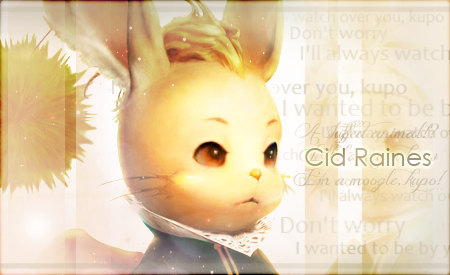
Lighting-perfect. Text-perfect. Image-Perfect :inlove: (I love 12's moogles :lew:) I love the focus on the eyes and text. The whole sig is very clean and smooth.
Good job :ryan:
 
^Thanks!

Just some pieces I did for my graphics shop. I am quite unhappy with them because some of the original images were of low quality. But nevertheless, here they are:

blanksig.png


blankavatar.png


zellsig.png


zellavatar.png
 
zellsig.png

The brights lights really work. This is really nice. You managed to take a low quality image and still make the finishing piece look really nice!

I think you are coming along extremely well, and I do not think that you are "not that good". So don't say that :mokken: (A reference to your first page :lew:)

Thank you so much :)
Yeah I have just editted the first page :P
 
Okay, this was supposed to be my entry for this week's SoTW, but I kinda misinterpreted what is required in the theme. So I am not submitting it. But I am very happy with this one. Angela Aki <3

angelaakialbumsig.png


I will redo the entry when I have the time in the next few days. (probably not using Angela anymore)
 
:ohoho: 
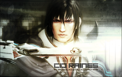
that is a really pretty signature Cid!! I love it! The colours are so soft and suit the person really well and the text is amazing. HOW'D YOU GET SO GOOD SO FAST!?!? :rage:
 
Back
Top