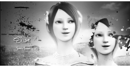
In this tutorial I will be creating a new signature, but here are some examples of the style I'm referring to:
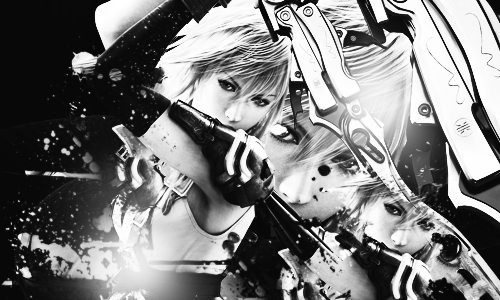

I don't have the PSD files for either signature, sorry.
This tutorial is meant for people who have a good understanding of how to work PhotoShop already. You will need to have paint splatter brushes already installed. You can find these on DeviantArt. It is a basic typed up tutorial because I'm too damn lazy to create one entire image.
Useful commands/references I make:
Ctrl + Alt + Shift + N - Create a new layer
Ctrl + Alt + Shift + E - Apply image
Making a layer invisible - Click the eye icon next to a layer
When I put asterisks and bolded text it means it's important that you follow it exactly, so fucking pay attention. Let's begin.

Choose your stock photo and place it on a canvas size of your choice. For this signature I am using the size 500x300. Clear images with lots of space at either side work best.
Create a new layer and apply the image. Set this layer to soft light and change the opacity to around 50%. The opacity level needed depends on the image you're using. For this darker image, I used 25%.
Create a new layer and apply the image. Get your burn tool and burn the areas you want to be darker (should be the background and near the bottom of the focal point). The opposite applies for the dodge tool, dodge the areas that you want to be lighter. This should be around your focal point. You can adjust the opacity of this layer if the changes seem too drastic.

Create a new layer and apply the image. Go to Filter > Render > Lighting Effects. Adjust until the preview looks like the top of the image is brighter but not too bright, and the bottom appears darker. This adds "depth", but also generally makes the image look better.
Erase the areas that look too bright. AKA the areas that burn your eyes.
Now the fun part. Choose a paint splatter brush, preferably a large one first. Create a new layer and...
splat paint. Don't be scared to cover up the focal because you can erase these later. Use a paint splatter brush as your eraser, this makes the erasing look cleaner.
* Make the paint brush layer invisible. * Create a new layer and apply the image. Right click this new layer and select Create Clipping Mask. Make both layers visible now. Move the applied image layer around until you like how it sits. You can also drag new images onto the canvas and repeat the process above, replacing the applied image with the new one. You can now erase areas that cover up too much.

It may look unappealing now but just stick to it.
Click Layer > New Adjustment Layer > Gradient Map and then OK. Click the bar and change to a * Black to White * gradient. DO NOT CHANGE THE LAYER STYLE. You could change the layer style to Color but I think not applying a style looks much better.
Create a new layer and select your soft brush at a size of around 250 px. Select a light grey - white color and click once in an area you think it would look good. You can change shades of grey and brush size as necessary.

Add text etc.

Add another Black to White gradient map if desired.
Create a new layer and apply the image. Filter > Other > High Pass. Set this layer to Soft Light and change the opacity to whatever you want. 50-60% usually looks best.
Add a border if desired and you are done!!! Simple, huh?

If there's a specific part of this tutorial that is hard to understand or you'd like clarification on how to do something, please ask. This was my first tutorial so please excuse any unclear directions.

If you're going to try and use this for a clan challenge or a callout involving me you deserve to rot in a special level of hell.
I don't have the PSD files for either signature, sorry.
This tutorial is meant for people who have a good understanding of how to work PhotoShop already. You will need to have paint splatter brushes already installed. You can find these on DeviantArt. It is a basic typed up tutorial because I'm too damn lazy to create one entire image.
Useful commands/references I make:
Ctrl + Alt + Shift + N - Create a new layer
Ctrl + Alt + Shift + E - Apply image
Making a layer invisible - Click the eye icon next to a layer
When I put asterisks and bolded text it means it's important that you follow it exactly, so fucking pay attention.
Let's begin.
Choose your stock photo and place it on a canvas size of your choice. For this signature I am using the size 500x300. Clear images with lots of space at either side work best.
Create a new layer and apply the image. Set this layer to soft light and change the opacity to around 50%. The opacity level needed depends on the image you're using. For this darker image, I used 25%.
Create a new layer and apply the image. Get your burn tool and burn the areas you want to be darker (should be the background and near the bottom of the focal point). The opposite applies for the dodge tool, dodge the areas that you want to be lighter. This should be around your focal point. You can adjust the opacity of this layer if the changes seem too drastic.
Create a new layer and apply the image. Go to Filter > Render > Lighting Effects. Adjust until the preview looks like the top of the image is brighter but not too bright, and the bottom appears darker. This adds "depth",
but also generally makes the image look better.Erase the areas that look too bright. AKA the areas that burn your eyes.
Now the fun part. Choose a paint splatter brush, preferably a large one first. Create a new layer and...
splat paint. Don't be scared to cover up the focal because you can erase these later. Use a paint splatter brush as your eraser, this makes the erasing look cleaner.
* Make the paint brush layer invisible. * Create a new layer and apply the image. Right click this new layer and select Create Clipping Mask. Make both layers visible now. Move the applied image layer around until you like how it sits. You can also drag new images onto the canvas and repeat the process above, replacing the applied image with the new one. You can now erase areas that cover up too much.
It may look unappealing now but just stick to it.
Click Layer > New Adjustment Layer > Gradient Map and then OK. Click the bar and change to a * Black to White * gradient. DO NOT CHANGE THE LAYER STYLE. You could change the layer style to Color but I think not applying a style looks much better.
Create a new layer and select your soft brush at a size of around 250 px. Select a light grey - white color and click once in an area you think it would look good. You can change shades of grey and brush size as necessary.
Add text etc.
Add another Black to White gradient map if desired.
Create a new layer and apply the image. Filter > Other > High Pass. Set this layer to Soft Light and change the opacity to whatever you want. 50-60% usually looks best.
Add a border if desired and you are done!!!
Simple, huh?
If there's a specific part of this tutorial that is hard to understand or you'd like clarification on how to do something, please ask. This was my first tutorial so please excuse any unclear directions.
If you're going to try and use this for a clan challenge or a callout involving me you deserve to rot in a special level of hell.
Last edited:
 I just love messy sigs.
 My DA searches failed me miserably.


 I shall try this out a.s.a.p and post my result. I love the messy effects and was wondering how you managed to achieve the final result.
 ") Thanks very much for posting this.
Thanks very much for posting this.