Cid's Newbie Graphics

zidanesigrequest2.png


:x3: :O :gasp: :awesome:


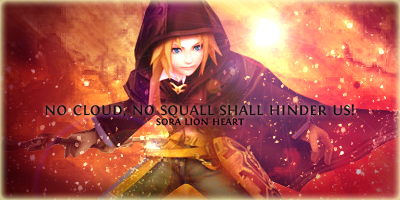
Like WOW! This is amazing! The lighting, the colours, the smudging effects are all awesome, your borders are nice anyway but this is awesome altogether. I personally wouldn't have put the text over Zidane, but it seems to work anyway.

Great improvement, well done @Cid XIII-2 :awesome:

Thanks :) I really appreciate your praise. I am also personally satisfied with this sig and the improvements I have made in just a week XD
 
zidanesigrequest2.png


that signature is win :awesome:

it looks soooo awesome lighting is amazing, text goes well but is a bit hard to read.. apart from that it a good signature.... keep up the good work :yay:
 
^Thanks ^^
Yeah the text, I am quite unhappy about it.

anyway

royalsigrequest2-1.png


sig for Noblesse Oblige.

EDIT:
another one:

sigrequestfire3.png

sig for DarkLordSephiroth66
 
Last edited:
el1c9i.jpg

this was my SoTW 214 entry. I know right... it's too washed out and dull. I saved it as JPEG lol. But what to do, I did it weeks ago when I was a fresh newbie :P

I think I will redo this sig because I personally feel the design is alright (red and blue feathers on opposing sides, and hidden upper face, mimicking crisis core cover design).

Will probably edit this post for an improvisation on that ugly sig.

EDIT:
BEFORE
el1c9i.jpg


AFTER
ashesigimprovisation2.png


Did I improve? :O
 
Last edited:
ashesigimprovisation2.png

Did I improve? :O

I think you improved a great deal!

This version looks awesome!

Lovely colours and the sketchy background looks good.

The lighting is well done and the text is placed much better in this signature. The font is neat too. I also like the glow around it, as it makes it stand out nicely as the focal.

Great work!

thank you very much :)

I thought that the sig will look better if it has a bigger size, but oh well. I am quite satisfied with it anyway.
 
6akPd9kWP9EAAAAASUVORK5CYII=
zidanesigrequest2.png


Ooh wow. I love this sig! The colours and effects make it gorgeous - so rich! - and the blending is fantastic. I love where you've positioned the render and how you've worked around his stance. The text is decently placed and you've used a good colour for it.
 
^thank you very much ^.^

anyway, I was bored and I experimented with some pokemon render earlier, and this is what I came up with:

miloticsig2.png


I think I have this guilty tendency of using warm colours o_O. I originally intended this to have shades of blue, but some things don't match and I felt that it's best to be in this colour scheme.

Gosh I really need some more variety in my work :)
 
miloticsig2.png


Be careful with that saturation, it could really hurt you at times. However, here I think you found a good balance. I'm not a big fan of the text, but I do like the different shades of the warm colors. I think this just needs a levels layer or two over it to make it a bit more complete, or maybe some dodging and burning could help out. Either way, it's good. ;)

Thanks for the feedback! :)

Well I did apply some color burn to the edges, but I'm still experimenting with these features.
 
I quite like your new signature the colours are very nice and warm... You done a good job on the blending as well :) im not a huge fan of the text apart from that it a very good signature... I see tat you have a signature shop now :yay: i might request on there later to see what you can do :wacky:
 
I quite like your new signature the colours are very nice and warm... You done a good job on the blending as well :) im not a huge fan of the text apart from that it a very good signature... I see tat you have a signature shop now :yay: i might request on there later to see what you can do :wacky:

Hey thanks ^-^

Yeah I just opened a sig shop. I will see what I can do. :)
 
Nice work. =)

Very nice and bright. The colours are nice and warm and give off a firey vibe.

Good lighting. It draws you to the centre.

Nice clean font used as well.

Overall a lovely signature. =)

Thanks =)

Yeah I am happy with the fire-ish vibe too, but ironically Milotic is a water pokemon lol.
 
fangsigfinal.png

now finally I can post my SoTW 215 entry, since it has ended.

I got 1 vote :x3:
I guess that's progress lol.

EDIT:
Sig for I/Sakura

chloesigrequest2.png


(lol I sub-consciously used warm color schemes again :()
 
Last edited:

Nice work on this one.

Nice lighting, though I think it would look nicer if it focused on Fang a bit more instead of the entire signature having the same level of light. It would draw our attention to her a bit more I think.

Other than that it's a lovely signature. Nice colours used and good placement of text.

Keep up the good work. =)

Thanks for the feedback :)

I personally prefer the Chloe sig that I recently made than this one. I agree about the lighting part.
 
deaththekidsig2.png

sig for Seiji

oh and sotw 216 entry. I am quite unhappy with that overly bright border :(
sotw216entryautumn3.png
 
Back
Top