There was no theme this week, and I received 3 entries.
1)

2)

3)
1)
2)
3)
Follow along with the video below to see how to install our site as a web app on your home screen.
Note: This feature may not be available in some browsers.


No one is far the best between the three, away than it's bad size.
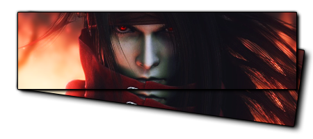
3: Has did nothing on it, expect a crop of a screen shot and rotating lower layer with adding shadow after merging.
 . I did just as much work to that stock photo as I've done to all my signatures, I can send you the stock photo if you like.


The matter is that I don't notice the difference between "one good job" and " several useless,effectless job with the same effect as the one good job."3 has a lot done to it, just because you can't notice doesn't mean its not there, matter fact is a compliment that I did such a good job you couldn't tell.

Shahab is only expressing his opinion that he doesn't think you've done much with your entry, and you're having a fit about it because it's harsh criticism. If you don't like CnC, then don't post GFX.And Shahab if you don't like it, then just shut up and move on. I don't know why you had to open your mouth in the first place. If you can't put up, shut up. Last time I remember you're not winning a grand prize in photoshop ethics mate =/.

Why be so narrow minded about it? Ask any graphics designer how many times their asked to manipulate photos as request.
And Shahab if you don't like it, then just shut up and move on. I don't know why you had to open your mouth in the first place. If you can't put up, shut up. Last time I remember you're not winning a grand prize in photoshop ethics mate =/.
The yellow part shows that I said that.Let's just drop it, Shahab I couldn't care less how much experience you have in design,
You asked about asking designers, so I said that.you were rude in assuming nothing was done the signature and assuming before thinking. And when I was 12 I was training in mixed martial arts, but doesn't make me the best, or better than people who have done it for less time.
I did not attack anyone, you got it wrong.Next time I suggest you ASK what was done, before jumping the gun mate.
If you look at the green and red parts of your own post, you'll see who should be respectful sir.if you want to express an opinion to me, do it in a respectful way. If not, then don't talk to me, otherwise I'll push back mate.
 And about the number 3, only thing I don't like is the white background. I would have prefered one of those backgrounds that blend abit better with the background.
Leki ish picking number 1, simply because L is pretty simple, and so is the banner thingie. Size is the only thing I don't like about it. I love number two as well.
And for this argument, I think simple things done to a picture---- they can be the very best of things. Try to change it to much, you just ruin it.