Theme: Nature
1.]
2.]
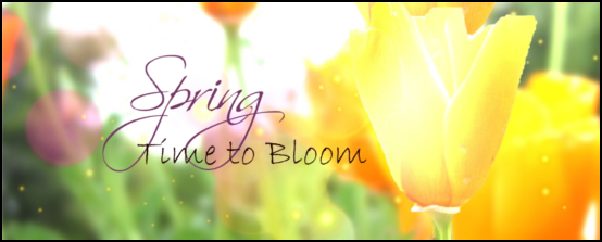
3.]

Thank you for entering this week, I really appreciate it!
Good luck, moo!
1.]

2.]

3.]

Thank you for entering this week, I really appreciate it!
Good luck, moo!
Follow along with the video below to see how to install our site as a web app on your home screen.
Note: This feature may not be available in some browsers.


 'Beautiful' is a bit of an understatement, but I'm going to have to say it: it's beautiful!
 I'm not so sure about the brighter, yellower flowers in the background... They do provide a good contrast, bringing out the focal point, but they feel a touch too vibrant. The rest of the piece is so gentle, I'd try toning the colour down just a little bit!
  Alternatively, add some depth to the left, but I personally think the tones on the left are perfect, so would advise you change the yellow. The text is pretty neat! Very gentle. I absolutely love the font you've used for 'Spring.' At a first glance, I also liked the text for 'Time to Bloom,' but a closer inspection makes me question whether or not this would be better in another font, either one more simple, or the same font as 'Spring.' I'm no expert on font so couldn't possibly recommend the best one! but I do feel there's something which would fit the piece just a little better.
 The fonts are also perfect! Whoever you are, you're a master of text. Please PM me the name of the font used to write 'White.' I want it!

 It's just ever so slightly more balanced, more striking and there is nothing at all I can suggest to improve on it.
 ) But I had to go with 1; it was just too beautiful