The theme this week is Nippon Ichi. Please remember, that while posting isn't necessary in order to count your vote, it is encouraged.
Also, please remember that you CANNOT vote for your own entry, and you will be disqualified from this SOTW, and the next two SOTWs if you do so.
Here are the entries I received :
1)

2)
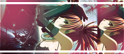
3)

4)

5)

Edit: You will have to click on some of the signatures to see them full size, as the forum automatically resizes images to 500x200.
Also, please remember that you CANNOT vote for your own entry, and you will be disqualified from this SOTW, and the next two SOTWs if you do so.
Here are the entries I received :
1)
2)
3)
4)
5)
Edit: You will have to click on some of the signatures to see them full size, as the forum automatically resizes images to 500x200.
Last edited:
 Really awesome use of colour and the effects are very fitting and look great IMO.