Navigation
Install the app
How to install the app on iOS
Follow along with the video below to see how to install our site as a web app on your home screen.
Note: This feature may not be available in some browsers.
More options
You are using an out of date browser. It may not display this or other websites correctly.
You should upgrade or use an alternative browser.
You should upgrade or use an alternative browser.
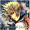
Sabriel's GFX Fusions
- Thread starter Sabriel
- Start date
- Tagged users None
- Status
- Not open for further replies.


I like the general idea of this one, and the rocky feeling it has. -go figure.
- only thing I'm not too fond of is the text, but at the same time I like it... Hmm... The green and pink work really nicely together as well.

OMG. The rendering is done really awesome if you did this yourself. The background I love, the text is omnomnom. I love how you placed the girl down just right enough, to give it a really sexy look as it stops right at her hips. Hints and details in the background are awesome, I really really like this LP. AWESOME job, Sab. <3
I think you should practise working with less colour. A lot of the colours your using are clashing with other ones. Having 5+ different colours in a tag is risky and rarely works imo unless its a heavily vectored tag in which case they bright and bold. IM using this luffy tag as an example.

The green, yellow, blue anpink dont flow together. Try and stick with 2 colours and work using different shades of them. The main two colours on your render are the red from his top and theres some light blue on his jeans try sticking with those colours and i think ul see improvements.

Now this is totally different i like it. Although theres still quite a few colours there they flow together much better and they fit the render. Keep working like this and ul get much better.
The text is a little hard to make out, maybe add a stroke to it or darken the area behin so it stands out more.
Keep posting)")
The green, yellow, blue anpink dont flow together. Try and stick with 2 colours and work using different shades of them. The main two colours on your render are the red from his top and theres some light blue on his jeans try sticking with those colours and i think ul see improvements.
Now this is totally different i like it. Although theres still quite a few colours there they flow together much better and they fit the render. Keep working like this and ul get much better.
The text is a little hard to make out, maybe add a stroke to it or darken the area behin so it stands out more.
Keep posting
Last edited:
I like the general idea of this one, and the rocky feeling it has. -
OMG. The rendering is done really awesome if you did this yourself. The background I love, the text is omnomnom. I love how you placed the girl down just right enough, to give it a really sexy look as it stops right at her hips. Hints and details in the background are awesome, I really really like this LP. AWESOME job, Sab. <3
I did the render myself; didn't know how to 'do' it. Thanks for the comments!
I think you should practise working with less colour. A lot of the colours your using are clashing with other ones. Having 5+ different colours in a tag is risky and rarely works imo unless its a heavily vectored tag in which case they bright and bold. IM using this luffy tag as an example.
The green, yellow, blue anpink dont flow together. Try and stick with 2 colours and work using different shades of them. The main two colours on your render are the red from his top and theres some light blue on his jeans try sticking with those colours and i think ul see improvements.
Now this is totally different i like it. Although theres still quite a few colours there they flow together much better and they fit the render. Keep working like this and ul get much better.
The text is a little hard to make out, maybe add a stroke to it or darken the area behin so it stands out more.
Keep posting
The first one I was just experimenting with the layer mode, in the end I just couldn't get the colours I wanted, but yeah, shoulda try a different approach. Thankies as well <333!

This one is a bit too blurry in my opinion. The quality of the signature isn't very good.
I like the image you've used though and the background is very cute with the flowers and butterflies.
I would suggest moving the girl further into the middle though.
The text is a bit hard to read due to the blurriness unfortunately.
For the avatar I would suggest choosing another font. The current one looks a bit messy.
The girl has been cut out very well though. There's no visible white areas or anything on her. I think you should blend her into the background a bit though so that she doesn't look so slapped on.
Other than that, keep posting your work and keep practicing. =)
Last edited:

I like it. Looks clean, the text could use some work on looking more clean, but I think something might help. Ya tried saving your works as PNGs? Quality comes out alot better. <3
I like the limegreen Starfire ontop of the overal colour theme you have going on in this sig. I like the render at the side, background is really pretty too. Keep it up babe.


This is a lovely avatar!
Very well done!
Lovely blending and the colours are very pretty!
The text looks great and placed reasonably well.
Lovely border rounds it off nicely. =)
This one looks pretty good, though I think that the image doesn't work so well with the background. The girl has a blue light glowing on her while the background is pink and kind of looks out of place.
The background looks nice but I think it's a tad too busy with brushes.
The text would also look better if it were a simpler font and a lighter colour for the text would make it stand out more. The pink is blending in with the background too much at the moment. =)
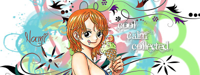
This one is very cute and the background works well with this picture.
The only thing I can suggest is to take away the text on the right of the signature and leave 'Nami' over on the left. =)
This one looks fine.
The background colours work well with the girls garments and the positon of the girl is great!
I would suggest blending in the girls edges a bit more though in order to make the white bits around her less noticeable. =)
Also a simpler font for the text would look much better and cleaner. =)
This one look better if the background wasn't covering his face.
I would suggest erasing the bits that are covering his face.
Other than that the text looks good and well positioned and the colour scheme looks nice. =)


I think what you really need to focus on in these is ensuring that the image you are using is clean and clear. =)
The ones you've used in the top three don't really look so good with the motion filter (I think that's what it is) in my opinion, as the rest of the background is already quite busy.
I would suggest using simpler backgrounds and not overcrowding them too much with images and colours etc.
Though I do like the last one.
The simple sepia tone looks nice and the focal is more apparent in this one. =)


<IMG id=TB_Image height=150 alt='
View Raw Image' src="http://i37.tinypic.com/dg18nc.jpg" width=400>
<IMG id=TB_Image height=100 alt='
View Raw Image' src="http://i33.tinypic.com/308brjd.jpg" width=100>
SOTW Entry and AOTW Entry
I won with the avatar") Yays~ and thx everybody
Yays~ and thx everybody
Round corners FAIL
View Raw Image' src="http://i37.tinypic.com/dg18nc.jpg" width=400>
<IMG id=TB_Image height=100 alt='
View Raw Image' src="http://i33.tinypic.com/308brjd.jpg" width=100>
SOTW Entry and AOTW Entry
I won with the avatar
Yays~ and thx everybodyRound corners FAIL


First of all congrats on winning AOTW. =D
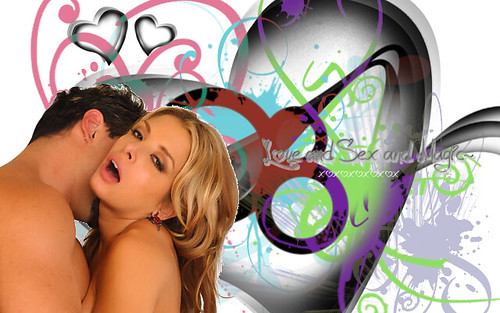
Now these two look very pretty.
The backgrounds are lovely colours and are detailed, though in the signature I would suggest erasing the pink bits covering the girl.
It kind of takes away from the focal and she tends to get lost in the background.
The heart behind the text is very nice and emphasises the text a lot. Lovely fonts used too by the way.
I don't mind the rounded corners on the signature personally either. =)
Other than that I would suggest at working on blending a bit more around the edges. =)
Great work!
 Anyways small update:
I like the detail in the background and how it matches the girls colours.
Though I think the lightning at the top of the signature looks a bit messy amongst the background.
The girl is placed well but I noticed that there is still a lot of white around her that wasn't erased. I would suggest blending her in with the background more in those areas to make it less noticeable or preferably go back and erase more around the image before putting her back in the signature. =)
The font used is a bit messy in my opinion. More simple looking texts tend to look better.
Other than that good work. =)

Good sig, the brushing is very good and colours flow very well throughout, and like Kandy said, you've done a good job keeping the colours neutral and matching Cheryl. For the font, I'd set the font as crisp or smooth/strong (can't remember the options without PS being open
 ) other than that, the font's good. And regarding the white around Cheryl, you've got two possible options, erase the white and blend it in with the background. Other than those two minor issues, very good sig!
Keep it up

Gor.ge.ous. background. Love the smokey-liquid colours, and the faded butterflies on it. Did you blend that girl in? If so, amazingly done. You love that font, don't you?
Word of advice - I dunno if you do this already - Your best interest would be to save the file as a .PNG, that leaves the quality for much much better than it is when you save it as .JPG ^^
Random LP I did when I was bored:
Lovely work on this one!
The colours are very pretty and I love the background! It looks like what Kira said, 'smokey-liquid'. XD
The girl looks cute and is blended in very well.
Also the text fits in very well here I think. 'Wonderland' looks great in that font!
The butterflies are a nice touch and overall it's lovely. =)
- Status
- Not open for further replies.