Photoshop Meddlings

Daenerys

The Last Dragon
Veteran
Joined
Nov 26, 2006
Messages
11,178
Age
33
Location
Suburban hell.
Gil
1
I deleted my old thread (deleting the first post deletes the thread - snazzeh) because my sigs were horrendous XD so heres a new thread, one i'm not ashamed off XD

Heres all my decent sigs so far.

Amandaavatar-1.jpg

Axelavvie.jpg


Renoavveh.jpg


Doublecast.jpg


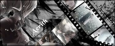
Aerithfilmstrip.jpg


non-purpleavrilsig.jpg


jeangrey5.png


tutorialattempt.jpg


Celes-1.jpg


lockeandceles.jpg


Agriassignature.png


Agriasminustext.png


greyscalerydia.png


Rydiasigcolored.png


Aerithversustutattempt.png


Tifadragonmag.png


Frantutattempt.png


android18redone.png


SOTW34.png
 
Last edited:
I made two different versions of this sig, although they don't differ much ^_^ on the second one i just used Filter > Brush Strokes > Sprayed Strokes

1st one

CelesxLocke.jpg


2nd one

CelesxLocke2.jpg


i thought the stock was adorable! <3
 
The Fabulous one is good, but the font is awful. The bg for the Phoenix one isn't bad either, but the stock doesn't fit well. You're definitely improving though.
 
These are my most recent 4 -

A pokemon one inspired after talking to Aeris Gainsborough

Pokemonsig.jpg


A weird Lulu / Edea one i don't remember making...it says i saved the file at 5am so....

EdeaandLulu.jpg


Heres the one i made following Liraels tutorial ^_^ and i thought it turned out quite well -

Aerithfilmstrip.jpg


As for this one, i followed a tutorial to get the basic back ground then added some grunge brushes to it, and as for the text, i was following a guide on how to make "icy" text but got too confused and just...improvised

luluicequeen.jpg
 
Last edited by a moderator:
I remember you making the LuluxEdea one because you asked me what quote would suit it :P

I love your Aerith one, it's cute and looks cool. It's deffo your best one to date.

As fer changing stuff as you use a tutorial, that's always the best way because you don't really want something that thousands of other people have made replicas of anyway. Stamp your mark on it, I say.

^_^
 
Heres a mew one i made following another Tutorial ^_^

mewsig.jpg


I'm having a hard time finding any tutorials that are easy enough to understand/follow =/
 
If you're looking to improve further, I think you need to make your work less predictable and obvious. I see you use several images of space for your background and you use really saturated colors. It gets old really fast. And you seem to be adamant on making the signatures mostly all the same size. I think you should mix it up now and then. It's not like it's going to kill you.

And some of the images look stretched too far in width and is not directionally proportional to the height. If you plan on sizing images up or down, you should really check the option in PhotoShop for it to size down proportionally, it just looks a lot better overall.

This CnC is not meant to beat you down at all and I hope you don't take it that way.
 
Heh, i tried something completely different when i made these sigs, i finally looked into what these C4D things tutorials kept mentioning and came up with these.....

Britneysig.jpg


Agrias-1.jpg
 
Last edited by a moderator:
Nice work. I noticed that some of the pictures seem to be warped, as if they were streched out. Some needed a little better blending. But I can say you're doing way better than when I first started XD. Keep up the good work =D
 
Last edited:
Heh thanks, Yeah Pictures aren't really my strongpoint ^__^;; But i hope to remedy That.

I followed another tutorial (mostly) and made 3 different versions of this one signiture ^_^

Avrilsig.jpg


non-purpleavrilsig.jpg


Blueversion.jpg
 
Hey one thing I learned is practice helps a lot. You may not notice at first, but after a while you'll get pretty good. I have trouble making sigs myself, cause I feel I can do better. I still get the "omg this is awesome" I simply respond "bleh". XP
 
I made these two following another tutorial ^_^ I used a lot of photo filters / gradient maps and other things in them, and it was all new to me.

1st sig by tutorial

Cloudsigatgtemptcopy.jpg


I don't like it myself =/ but it's an improvement on what i have been doing.

2nd attempt

edea-1.jpg


IMO this ones much better ^_^
 
I love the Vivi, Garnet, and CloudxAeris sigs. ^.^
I just love lots of colors! ^.^
(Plus there needs to be more FFIX sigs out there!!!!)
 
I like the Avril Lavigne ones, nice effect, though in the last one the colors are too strong and kind of hurt my eyes. Still good job :)

Also the Cloud one is good, needs a little work on the text though.

Keep at it. :)
 
Aww, no more posts. Mark sad :(

Three signatures i made following tutorials...

jeangrey5.png


and these two, i made the first one...disliked it, and changed most of it xD it was too late to remove the clipping masks part though.

Jeangrey3.jpg


jeangrey6.jpg
 
Back
Top