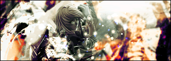
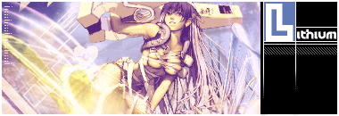
►Welcome to my Art Gallery. Everything is in order of what I have made.◄
Showing the progress of my techniques I have gained and how much better I have go and will hopefully get better.
So it would be much appreciated if may I could get a few pointers so i may progress better

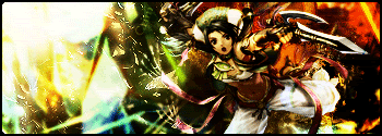
Showing the progress of my techniques I have gained and how much better I have go and will hopefully get better.
So it would be much appreciated if may I could get a few pointers so i may progress better
≡≡≡≡≡≡≡≡≡≡≡≡≡≡≡≡≡≡≡≡≡≡≡≡≡≡≡≡≡≡≡≡

≡≡≡≡≡≡≡≡≡≡≡≡≡≡≡≡≡≡≡≡≡≡≡≡≡≡≡≡≡≡
≡≡≡≡≡≡≡≡≡≡≡≡≡≡≡≡≡≡≡≡≡≡≡≡≡≡≡
≡≡≡≡≡≡≡≡≡≡≡≡≡≡≡≡≡≡≡≡≡≡≡≡≡≡≡

≡≡≡≡≡≡≡≡≡≡≡≡≡≡≡≡≡≡≡≡≡≡≡≡≡≡≡≡≡≡≡≡
≡≡≡≡≡≡≡≡≡≡≡≡≡≡≡≡≡≡≡≡≡≡≡≡≡≡≡≡≡≡≡≡≡

≡≡≡≡≡≡≡≡≡≡≡≡≡≡≡≡≡≡≡≡≡≡≡≡≡≡≡≡≡≡≡≡≡

≡≡≡≡≡≡≡≡≡≡≡≡≡≡≡≡≡≡≡≡≡≡≡≡≡≡≡≡≡≡≡≡≡
≡≡≡≡≡≡≡≡≡≡≡≡≡≡≡≡≡≡≡≡≡≡≡≡≡≡≡≡≡≡≡

≡≡≡≡≡≡≡≡≡≡≡≡≡≡≡≡≡≡≡≡≡≡≡≡≡≡≡≡≡≡≡

≡≡≡≡≡≡≡≡≡≡≡≡≡≡≡≡≡≡≡≡≡≡≡≡≡≡≡≡≡≡≡≡≡
≡≡≡≡≡≡≡≡≡≡≡≡≡≡≡≡≡≡≡≡≡≡≡≡≡≡≡≡≡≡≡≡≡
≡≡≡≡≡≡≡≡≡≡≡≡≡≡≡≡≡≡≡≡≡≡≡≡≡≡≡≡≡≡≡≡
≡≡≡≡≡≡≡≡≡≡≡≡≡≡≡≡≡≡≡≡≡≡≡≡≡≡≡≡≡≡≡≡
≡≡≡≡≡≡≡≡≡≡≡≡≡≡≡≡≡≡≡≡≡≡≡≡≡≡≡≡≡≡≡≡≡≡≡

≡≡≡≡≡≡≡≡≡≡≡≡≡≡≡≡≡≡≡≡≡≡≡≡≡≡≡≡≡≡≡≡

≡≡≡≡≡≡≡≡≡≡≡≡≡≡≡≡≡≡≡≡≡≡≡≡≡≡≡≡≡≡≡≡

≡≡≡≡≡≡≡≡≡≡≡≡≡≡≡≡≡≡≡≡≡≡≡≡≡≡≡≡≡

====================================

===================================

≡≡≡≡≡≡≡≡≡≡≡≡≡≡≡≡≡≡≡≡≡≡≡≡≡≡≡≡≡≡
≡≡≡≡≡≡≡≡≡≡≡≡≡≡≡≡≡≡≡≡≡≡≡≡≡≡≡
≡≡≡≡≡≡≡≡≡≡≡≡≡≡≡≡≡≡≡≡≡≡≡≡≡≡≡
≡≡≡≡≡≡≡≡≡≡≡≡≡≡≡≡≡≡≡≡≡≡≡≡≡≡≡≡≡≡≡≡
≡≡≡≡≡≡≡≡≡≡≡≡≡≡≡≡≡≡≡≡≡≡≡≡≡≡≡≡≡≡≡≡≡
≡≡≡≡≡≡≡≡≡≡≡≡≡≡≡≡≡≡≡≡≡≡≡≡≡≡≡≡≡≡≡≡≡
≡≡≡≡≡≡≡≡≡≡≡≡≡≡≡≡≡≡≡≡≡≡≡≡≡≡≡≡≡≡≡≡≡
≡≡≡≡≡≡≡≡≡≡≡≡≡≡≡≡≡≡≡≡≡≡≡≡≡≡≡≡≡≡≡
≡≡≡≡≡≡≡≡≡≡≡≡≡≡≡≡≡≡≡≡≡≡≡≡≡≡≡≡≡≡≡
≡≡≡≡≡≡≡≡≡≡≡≡≡≡≡≡≡≡≡≡≡≡≡≡≡≡≡≡≡≡≡≡≡
≡≡≡≡≡≡≡≡≡≡≡≡≡≡≡≡≡≡≡≡≡≡≡≡≡≡≡≡≡≡≡≡≡
≡≡≡≡≡≡≡≡≡≡≡≡≡≡≡≡≡≡≡≡≡≡≡≡≡≡≡≡≡≡≡≡
≡≡≡≡≡≡≡≡≡≡≡≡≡≡≡≡≡≡≡≡≡≡≡≡≡≡≡≡≡≡≡≡
≡≡≡≡≡≡≡≡≡≡≡≡≡≡≡≡≡≡≡≡≡≡≡≡≡≡≡≡≡≡≡≡≡≡≡
≡≡≡≡≡≡≡≡≡≡≡≡≡≡≡≡≡≡≡≡≡≡≡≡≡≡≡≡≡≡≡≡
≡≡≡≡≡≡≡≡≡≡≡≡≡≡≡≡≡≡≡≡≡≡≡≡≡≡≡≡≡≡≡≡
≡≡≡≡≡≡≡≡≡≡≡≡≡≡≡≡≡≡≡≡≡≡≡≡≡≡≡≡≡
====================================
===================================
Last edited:
")
)")


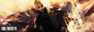
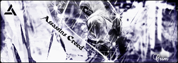
 it's good but I'm not sure about the colors, though. =\


 have a nice day dont work so hard