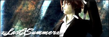
My latest sig

Hmm...I don't see any sig. =/ Unless you're talking about the one in your signature...? If so, you might wanna post it up anyway. ;)

How long have you been using Photoshop? It's pretty good, but I'm not too crazy with the lines in the background. Maybe lessen it just a bit...? You have a nice background going on and it would be cool to actually see more of the details.
 
siggie.jpg


I say the background is cool, though the image looks a bit blurry. The font is also hard to read, so I suggest a more simple font for the next signature.

To give you an example, I use fonts like Verdana or Times New Roman for signatures.
 
Last edited:
Cheers been using photoshop for just under a year. I can never make the text look good ever lmao
 
Try using a better quality stock. Also, you might want to read a few tutorials on cutting. Some of the edges are bad, and there is a white outline in some places.

Like the colours, but maybe spend a bit more time on blending. Perhaps having the lines go over his face isn't such a good idea. Nice stuff though.
 
It took me a while to get off the scanline pattern, but with the critiques of some buds, I learned that it turns some pieces out to be a bit shoddy.

I'd suggest lowering the opacity on them a bit and checking out smudging.

The texture of the background is pretty appealing, though.
 
It's a good start, but the scanlines are a little bit too predominant. The text could be improved; the font doesn't suit the image and the colour's not quite right. Could use a little blending too.
 
Remember that a tag does not have to have text to be a good piece. If you can't seem to make text look good on a tag, then ditch it. XD That's what I do, for I have the same problem.

Love the background. Just take down the opacity of the scanlines a bit, add some lighting and blending, and help the stock match the background better by using selective coloring layers, photo fiters, etc. Most of the time, you also want to direct the attention of the tag to the center, so perhaps you shouldn't put abrupt light colors on the end.
 
Last edited:
Back
Top