Kellys GFX attempts

Bambi

Dark Knight
Veteran
Joined
Aug 28, 2007
Messages
13,511
Location
Manchester
Gil
223
FFXIV
Bambi Branford
FFXIV Server
Lamia
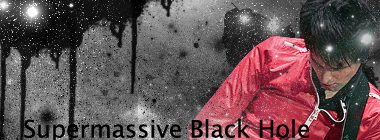
Mattsigattemptcopy.png


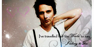
Please don't get technical with your criticism, I won't understand a fucking word of it 8F I need all the help I can get though, I'm not a natural at this shit xD

Also, the text was a fucking bugger and it's shite

:mokken:
 
Its actually not bad, at least in my opinion. The text, as you must know is quite bad, but the overall theme of the picture is great. Look at tutorials so that you can get the hang of whatever graphics program you are using. Happy graphics ^_^
 
Hahahaha I got stuck on brushes on the tutorial I tried so I just fucked it off, accidentally deleted the one I was trying to work on and jkust knocked that one out, if did my fuckinghead in :mokken: It's gunna take some practice.... I think I need to get to grips with PS first just have a general fiddle with it, and once I know what it all is then the tutorials should make a little bit more sense, couldn't make heads nor fucing tales of it :rage:

Cheers for the comment haha I was beginning to think it was too shit for comments. And I have NO idea how to work the text, I just slapped it in there, so I guess that's summat else Il have to look up. Confusing shit I tell you, give me a pen and paper any day :dry:
 
For a first go, it's not bad at all Kel-bear.

Try bringing your image (in this case Matt) in a little more towards the center so it's not at the edge, though. And try not to brush too much over him.

It's one of the best first attempts at a sig I've seen though, tbh.

Text isn't THAT bad. Font is simple. Maybe make it a little smaller and take it away from the bottom and have it up a little more. I prefer simple text, it looks cleaner.

You've not overdone it with the brushes and I like the area to the top left. It's agood siggy babes. Now just keep practising. =3
 
I agree, it is a very good first attempt. :)

Of course, reading tutorials and getting to know PS will help you get better but just a few tips that I think might help:
Try and use colours from the render. The black/grey kinda clashes with the red of the jacket.
Also try and keep the text a bit smaller and use several lines of text, rather that it being all in one line.
Notice the angle of the render to keep effects flowing in the same direction and keep in mind where the light is coming from by looking at shadows etc.

Keep it up (y) Since you can actually draw very well, you should have no problem getting the hang of it. Those skills will certainly come in handy.
 
Also try and keep the text a bit smaller and use several lines of text, rather that it being all in one line.
Notice the angle of the render to keep effects flowing in the same direction and keep in mind where the light is coming from by looking at shadows etc.

Ooh, I'l bear that in mind 8F

Also, just thought I'd explain why he's so far over to the left :wacky:

The image had some weird other imagey effort next to his arm and I didnt like it so I chopped it off, and then it was liek a straight line thingy down his arm so I just shoved it in the corner

I'l keep at it it anyway, thanks for the encouraging comments :yay:
 
Like everybody has said it is a damn good first attempt. I mean I tried to mess around with PS for about a month and none of my stuff came out looking even remotely like that. I and I read and watched plenty of tuts. I think you have a natural talent Kels. :D

I say keep em coming and great job!!!
 
The image had some weird other imagey effort next to his arm and I didnt like it so I chopped it off, and then it was liek a straight line thingy down his arm so I just shoved it in the corner

Haha I've had to work with pictures like that before. You could do quite a lot of things with the left half of the tag, and it would still look good leaving the person in the right half. You could even move him to the center and put a brush over the cut off arm. lol

I would have to agree with what everyone else has said though. It's a really good signature for your first one! Good job. Keep at it and show more. ^_^
 
Had a feeling it would be the fitness that is Mr Bellamy :D

For a first go hun, thats fantastic! The image has been cut well and the brushes used all suit well. The text is good, maybe hunt on DA or some other font sites. Keep up the good work hun, you are a talented artist :-)
 
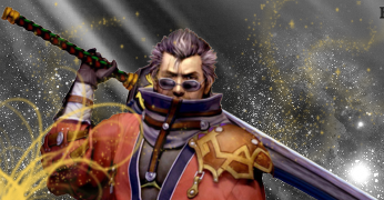
I swear Ive not ignored the feedback, even still I thin this one has come out worse and it took me longer, I just couldn't get it right, I was just gunna not save it and fuck it off, but alas

Auronfail.png


I completely gave up with the text, I just don't get it. I thin I'l get some tutorials on the go tomorrow, otherwise Im just gunna be constantly knocking shite like this out because Ive no idea wtf I'm doing 8F

EDit* I'm looking at it and it's just utter shite, I'm leaving PS well alone til Ive had a bash at some tutorials now 8F I just like playing with the brushes xD
 
I just like playing with the brushes xD

Good! That's exactly what you should be doing. Once you get a feel of how everything works you'll be able to start learning the basics etc.

You've already improved with your second attempt. The effects in the bottom right look really cool and your eyes are drawn to them, and the flow up the sword to Auron's face etc.
Remember to blend in Auron though. You can do this by smudging the edges, using a soft eraser to make it look like he fades into the background or use some subtle brushing.

Keep it up (y)

Oh, I wrote a tutorial so if you ever have a go and need help, give me a shout :gasp:
 
I don't know much about graphics. I mean I make 'em on occasion but I don't get technical with them. Anyway, for first time graphics these really aren't bad, Kels. I think perhaps on the Auron one you overdid it a bit with the brushes, but other than that like I told you on MSN, keep practicing and keep studying tutorials. Photoshop can be intimidating at first but once you use it for awhile you'll get the hang of it.
 
Mattsigattemptcopy.png


Wow. I love it.Matt there was perfect placing. And the text matches the sig perfectly. Make it smaller :vikki: JK!

Brushes are ver nice, keep working on it, don't use a whole load of one brush etc. :monster:

You certainly did better than me when I first started GFX ^_^
 
rainbow.png


Not entirrely sure what I was trying to achieve, I was just having more of a play with the non-brushes side of things 8F
 
Thats really nice kelly,
I catches the eye, its nice and bright but it doesnt burn your eyes. the brushwork in the corner fits the piece.

Wonderful work!
Keep it up!
 
Thanks again for the encouragement guys, I would have given up at the first sig if it wasn't for you lot 8F

Ive had another play, it's so addictive :gonk:

I had an accident with the edges, I dont know how to do borders, that was just...there so I left it hahaha

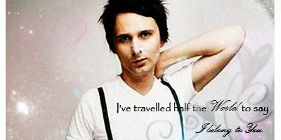
matt2copy.png


matt2copy-1.png


edit* Just knocked this one out. Obviously its massive, but Im just playing around, I'm quite happy with this one actually. I like pretty stars 8F

twilightcopy.png
 
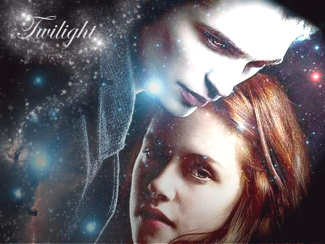
These are getting loads better as you make them, Kel! I'm liking the Matt one, but not too fond of the text placement or the font. The Twilight one is awesome too! I'd not overdo it with the brushes though. I think maybe some of the stars could come off of Bella's face a bit. Other than those small things, keep it up girl! You're doing great!
 
Yeah, I get carried away with the brushes, I'l have to work on not over doingthat haha

As for the text, all I can say is now I know why Lewis hates doing sigs for me, text is a pain and I hate it :rage:

Edit* I just had a look at the Twilight image, and the stars over bellas face arent a brush, it's an image of stars I found so I cant remove them 8F Well, If I can I dunno how to, Il have to have a fiddle...... *has fiddled and cant seem to erase them*
 
Did you put the image on a separate layer? If so, what you can do is just get a regular round brush and take it down to 0% and then softly just use the fuzzy brush to remove the stars only around Bella's face.
 
Back
Top