Ike Creations

I know it's fast, but I really think that I may have struck gold with one of these. I gained some new knowledge from tutorials and I think that I did good on these two ^_^

ShadowSiggycopy.png


JinKazamacopy.png
 
JinKazamacopy.png

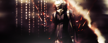
That is bloody BRILLIANT! I love the use of colors and the placement of the font is perfect! The effects behind him are great! Ike, I really think this is great.
 

I really do like this one!

You've done a great job with this!

The background looks awesome around him! It looks like an explosion has just happened behind him. >.<

Great use of lighting. It focuses on the focal very well.

Blending is well done and the text is well placed. The font looks good too.

Keep up the good work!
 
ShadowSiggycopy.png


That quote... ARGH!

Love the blending here, the BG is nice. The only thing that could make the piece more betterer is take off that top line of text >_>;;

JinKazamacopy.png


That is love. Wha- Italics?

Anyways, the text is excellent in this piece, love the effects around Jin, colour scheme suits it very much, nice border to finish it off.

Keep it up Sean <3
 
Two new siggies. They may not be too good, but I think they get the job done for now :)

AsterPhoenix.png


Burstinatrix.png
 
Hehe! Ike's back! :P


I love the whole Yugioh GX theme...

For the first one with the guy in white. I like the blending and the colors but I don't think the whole white arrow line things were neccessary. Its a ghreat sig!

I really like the burstinatrix one though the only thing I would have to say is the color seems a little off and it looks a little like she's been smudged here and there...

Yaaay!
 
Phew! Boy this sig is amazing!
Izanagi.png


I LOVE the effects (number code)in the background. The focal point is amazing!

Great job.
 

Woow, pretty amazing! I've looked through your previous works and I have to say that the improvement is incredible.

I love how in this one, the text in the back and the haziness that seemingly seeps into the signature create depth. I also like how you've kept some parts empty and dark, love the feeling and mood it gives. ❤
 
Terra.png


I really adore it, Sean. The effects around Terra :-)wacky:) has a attractive flowery pattern, nice colour scheme and lighting; border topped it all off. Definitely one of your best, in my opinion.

Keep it up <3 :tighthug:
 
SoraSignature.png


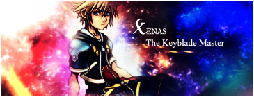
I love the BG, how it's ripply and glassy. Sora's well placed; I'd say cut out the half border and change the text, or leave it with no text at all. Everything else is epic (y)

DarkSaber.png


I love the colours in this one! The colour scheme is very appealing, and the stock is too. Try using outer glow with grey on the text to make it stand out a bit more :hmmm:

All in all, very nice job <3 Keep it up Sean! ^^
 

I really like this one.

I love the shadow cast throughout the signature and the texture in the background looks neat.

That blue bit near Sora looks like it needs to be removed though. Seems like it was missed.

Text is nice and simple, though I think it needs to be a tad smaller in size.

The half border rounds it off nicely. =)

Keep up the good work!
 
Woah. :D I really think you have improved majorly, both graphic and text wise.

Your latest two are your best works, and the Sora one is gorgeous! The colours look very sparkly, and the text is position well! The Zack one felt a bit empty, but once again, gorgeous effects.

You're definitely improving! Keep them coming. :D
 
Back
Top