"Graphics" by me...

Whoareyou

It would be irresponsible not to drink
Veteran
Joined
Oct 19, 2009
Messages
567
Age
33
Location
London
Gil
1
I've asked around and I'm pretty sure this is the right place.
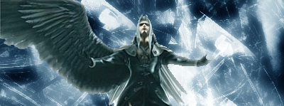


SephirothAttempt1.png


So here is my first attempt at creating "graphics" using some things I found...
All comments are welcomed and I may well post more in here in the future...
We shall see.
 
Last edited:
That is pretty good for your first sig. A little more rendering practice would be great. And I love the background, really balances out the whole thing. But one thing about that is, the background becomes your main focal point besides Sephiroth in my opinion. It's pretty bright. The lighting in this peice is very nice though.
 
For a first sig, you're a heck of a lot better than me already. :D

You've got some nice / well lit effects there that really stand out, and your render placement is spot on. And you have the effects / brushes so that they balance out the side missing the wing. The light almost becomes a sort of phantom wing.

The main thing to do would perhaps smoothen the edges of the render as it is very jagged, especially on the top right of Sephiroth. Other than that the render was well cut.

Keep up the good work, I'd like to see more!
 
SephirothAttempt1.png


This is not bad at all. Waay better than one of my first ones. You could have blended him in more. He just looks slapped onto a stock. Look for some tutorials for sig making and you will get much better. This is not bad for a start, though.

The background is great, but there is too much of it, which takes away attention from your focal, Sephiroth. You should look up how to crop that extra space that isn't doing anything. And try to start experimenting with text as early as you can.
 
:gasp:

What Sean said :wacky:

For your first sig, it is absolutely perfect IMO. The stock gives a really nice feel, and Sephy in the middle is good placement, although I can't help wondering if he is slightly squished >_> Colour scheme is fab, don't forget tect in the future (but it doesn't look good on all the sigs) blah blah blah etc. Keep it up, Lee! :3 :elmo:
 
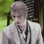
Ok then here is attempt number two. Sticking with the Final Fantasy VII theme but still no text. I'm gonna get some help on that from Vikki's graphics school next month.

RufusFinal.png


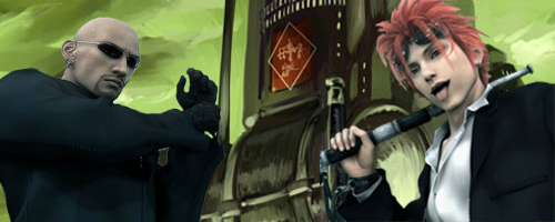
RenoandRudeFinal.png


OK (y) Comments and such much appreciated again guys.

(Just a note, I need to thank Squee for the render of Reno)

EDIT: Going to be using this avatar with my sig :mokken:
 
Last edited:
Text is a pain imo, That is my :fail: point, so it would be great to get advice for that, I STILL dont have text down. Although there should be a few effects to this, your starting almost the way I started, and for a newbie, your renders are pretty great. If you ever find a difficult render, you can always ask me in my render shop.

now onto what you have done. It is clear imo that that background for reno and rude is not completely stock if I am not mistaken. The lighting looks as though it has been changed, and it fits well for the characters. One thing is for sure though, Layers are your friend, how many layers did you use? and playing with transparancy can almost always help blend a character into an image.

Your off at a good start, experimenting more than when I first started. I'm looking forward to seeing more.
 
Back
Top