A thing I did

Will Graham

Hello, Dr. Lecter
Veteran
Joined
Aug 10, 2010
Messages
1,920
Location
Salinas, where the women go forever
Gil
0
Lewis convinced me to have a go at making a sig, so I did. I think it is ok for my first one, but the text is not great at all. Please criticise it for me etc. and then I will make more things

20tl0dt.png


This is the stock I used
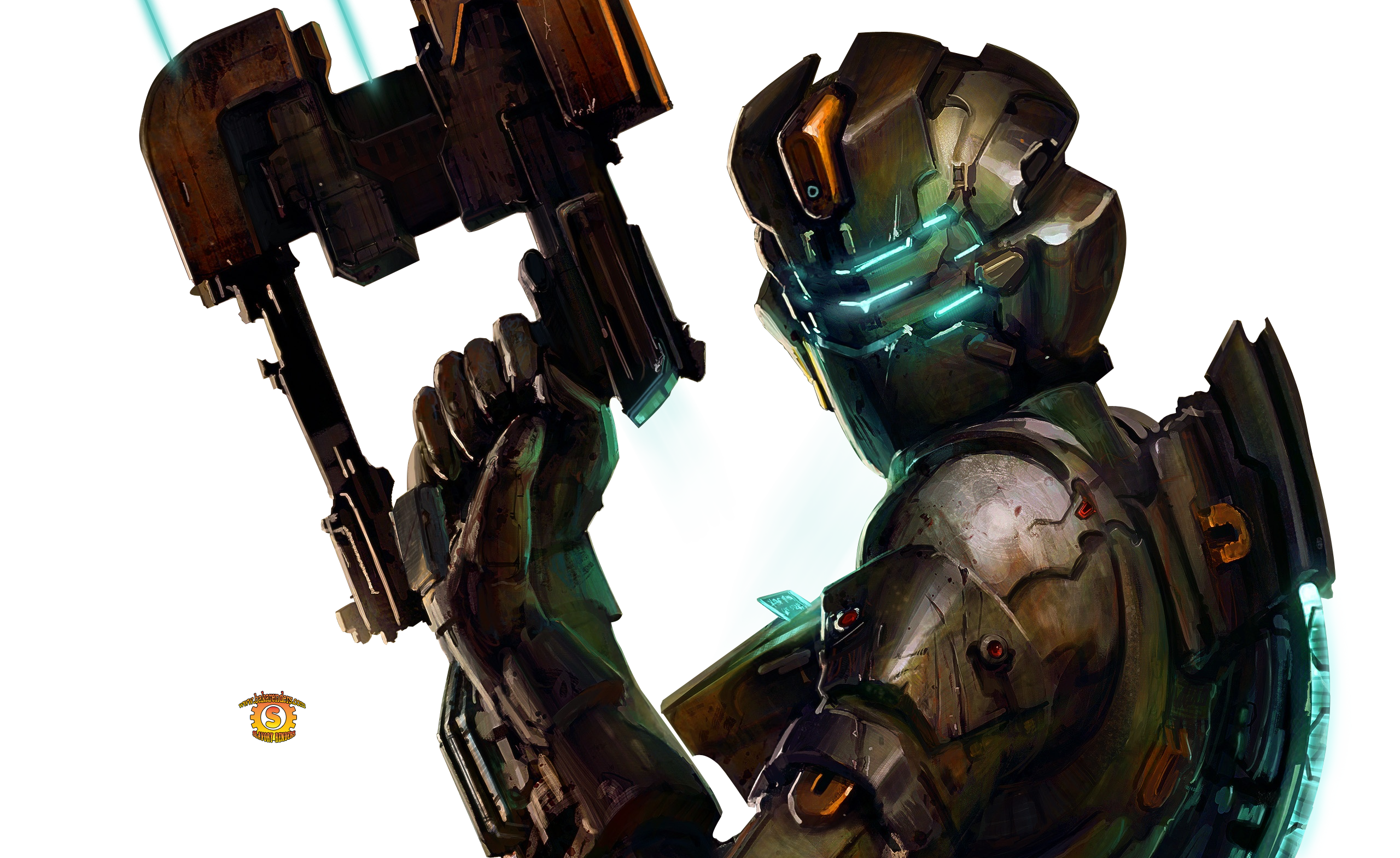
character_bio_576_superman.jpg

nwap34.png


this is the stock
lana-del-rey-4eb92047984cf.jpg

zuil2v.png


Stock
dead-space-2-sigtutorials.png

1g21lf.png


Stock
sora%20render%20copy.png

286xzs7.png


stock
izaya_render_by_ikah92-d3aqqj3.png

w8q25l.png


stock
tumblr_mdbptihD981rnts4ao1_1280.jpg
 
Last edited:
I do not believe you made that :ahmed:

on the off chance you did it looks quite good
 
Youv got talent man. I already sais i would have superman a little more to the left so theres slightly less empty space but youv done a seriously good job. Its extremely rare to see beginners that make good sigs on their first attempt. The lana del rey one you showed me on msn is brilliant aswell.
Keep reading those tutorials man and in a few weeks your gunna be a seriously good sig maker.
And text is one of the hardest things to make neat in a sig. Just ask anyone whos been doing GFX for a long time. Text isnt easy but the test in that superman sig is very good. Its not perfect but youv done a gret job with placement and kept it close to the focal which is what you should do. Most newbies to photoshop always put text in the corner or they have it split up in different corners of the sig and it looks messy.

Doing a good job mate. Keep it up (y)
 
I dont think theres too much blank space at all. Sometimes empty space works well if done properly and that one has it done properly. I love the colours youv used more than anything. The little rectangle seems a bit out of place i think if you did a few more of them at differnt sizes it would look really cool.
Also try this.

Image > apply image > Filter > distort > displace then select a PSD file. Itl give a cool effect you just need to erase the bits you dont want.
 
These are really nice! You've definitely referred to the right tutorials haha. The second one's clipping masks kinda look super random, but for your second tag, it's excellent O:
 
That Lana del rey sig is very nice, though I am not sure what that tiny little rectangle on the right is but the rest of it is very nice. I know text doesn't always make a piece look better but in this case I think a little line of text would have finished it off nicely!
 
I loik it but it would look better if you could see the render a little better, the effects are too strong :hmmm: I think the left side is a bit too bare too, but otherwise it's really good :griin: The text is amazing btw
 
Yeah, I agree. It's pretty cluttered towards the right and the left looks bland/boring, mostly because of too much negative space. Some negative space is nice, but too much of it is bad for any sig. Too much going on towards the right, however. What I would do is try cleaning up on the right and moving some of the effects towards the left so that it's a little more balanced. Right now, it weighs too heavily on one side, making the tag look very imbalanced.
 
Very good, Conor. I would only change the text a bit, by maybe moving it to the left a bit more and also maybe a different font, but I quite like the effects you used around sora! One thing I noticed and I am not sure if it is an accident or whatever but you seem to have a white line at the bottom like you were trying to do a border but forgot to add the extra lines on the other three sides?

Either way great sig!


No I sneezed and moved something out of place, then forgot to put it back. Thank you toni, the text is very difficult to do and I did not spend very long thinking about it. I need to master text-fu
 
It's awesome! MAYBE move the text somewhere else? But other than that it's like you took a pic and primary color paint blotched it. Which, I THINK, looks amazing.

EDIT: Oh jeez... Toni beat me to the text thing :ari:
 
Wow. I'm really impressed, Conor. I heard you were getting tips from Lewis, but I did not expect this. :lew: Are you enjoying making graphics, or is it just something to pass the time? Either way, I don't mind giving you tips on text. I'm really not the text guru people make me out to be, but. :lew: If you ask for help I'm not gonna say no. I'd suggest scanning through this a bit: http://www.finalfantasyforums.net/threads/47021-TUT-Typography-by-Six

I highly suggest going with a bit easier fonts to begin with, dafont.com has nice catagories where you can pick a lot of 'easy going' fonts with. Nothing too fancy yet. If you'd like to use two fonts, I suggest a blocky font at the bottom, and the cursives at the top. 'Complimentary' in that one link I posted.

If you want something a bit more challenging: http://www.finalfantasyforums.net/threads/52140-TUT-Creative-Text-Tutorial

I think your text is actually very good. The only one I think was a bit of a step back was the Sora one. I think the line is short, so a bit of a stretched out font or something cursive in this case might work. I don't think the standard font really worked in this. :D

If I can help more just @ me whenever, and I'm more than willing to give you font suggestions and the likes.
 
Thank you Kirabbz, that is very kind of you to say. Lewis gave some advice on the text for them and some effects on the Isaac one so I cannot take all of the credit! That first tutorial looks very excellent, I will have to read it a few times. I also like that second effect too. I am enjoying it a lot, but I only started last night so I cannot say I will be into it forever. For now it is a lot of fun though
 
Mate, those are some tasty sigs. It doesn't seem like you've just started out. My favourite is the Isaac sig.

I am in no way an expert, but you asked me to make a comment so here's what I personally think you should do if you want to get better. Although that makes me sound like a knob. :(

It's hard to make text look good. A lot of tutorials have a text section. Why the fuck should you add text because a tutorial said so? I skip text in loads of my sigs because I don't think it's a requirement so remember you don't have to add it. Let the effects speak for themselves. And Isaac Clarke is such a legend that anyone who needs to be told his name on a sig is a moron anyway.

Also, your sigs are only as good as your resources. People can bang on about how signature making is art, and there is some truth to that, it is a manipulation of resources which is your own. But it is using resources. I would recommend you go to FringeFX.net as they have some amazing resources such as C4Ds and stocks to use. They also have PSD packs which are incredible because you can look through the layers of sigs that people have made and see exactly what they did to make an awesome sig. This is by far the most useful thing to do IMO, I have benefitted from it greatly anyway. It also teaches how to use features of PS you might not have considered, like the channel mixer or photo filters. Learn from others before you.

I would also recommend joining GFXResource.com. The sig makers there are also very good. The top people have a similar style though which is quite colourful and they love adding text to their sigs, but they have a very different style to the people on Fringe. The people on Fringe tend to have an effect based style which is very intricate but can lack depth, the people on GFX have a very colourful and depth based style. Again, learn from others and get good resources and see how other people create their GFX.

If you're serious about making GFX, you need to get great resources which means going through different GFX forums and downloading them. Once you have great resources, and understand photoshop, you can start putting your own twist on things and making your own style.

Good luck, GFX is really fun so I hope it goes well. Again, I don't mean to sound like a know it all, but if you want help or my opinion just ask. (y)
 
Back
Top