A thing I did

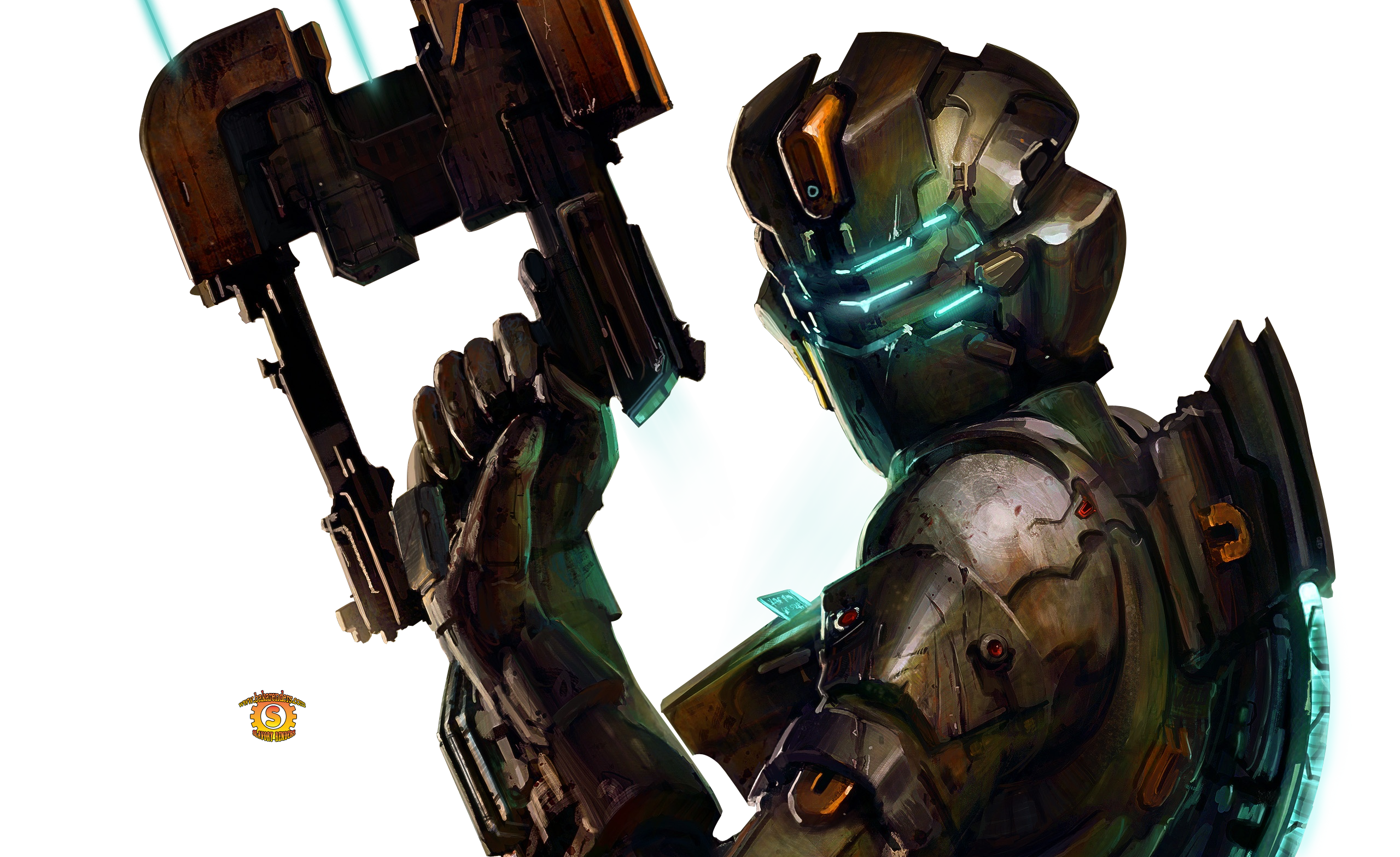
I had exams the past few days, so I didn't get anything done till tonight. I tried a radically different style this time, I was using the pen tool which was really weird to use at first. I think some bits look a kinda good, but it just looks tacky and cheap overall. Please tell me what is wrong with it, thank you.

286xzs7.png


stock
izaya_render_by_ikah92-d3aqqj3.png
 
That is a pretty good attempt at something new! I like it, it kind of looks like a cut out or something, perhaps a colour other than purple would have suited that particular render but thats just a tiny nitpick. I like the text in the background too, very nice. One other thing I would change besides the colour are the dots on his right side, they look a tiny bit out of place or something but again, just a tiny thing. Nice work conor.
 
I like this one a lot at the minute, but please tell me what is wrong with it pals!
Big Casino
Squidward
Six
Oxide
Alex Mason

I hope it is not rude to @ you in order to get my stuff criticised :hal:

w8q25l.png


stock
tumblr_mdbptihD981rnts4ao1_1280.jpg
 
Its too small. Make it bigger so we can see it in its glory. Seriously good job mate. You are progressing so quick :rage:
 
I like this one a lot at the minute, but please tell me what is wrong with it pals!

@Big Casino
@Squidward
@Six
@Oxide
@Alex Mason

I hope it is not rude to @ you in order to get my stuff criticised :hal:
haha :lew: of course it's not rude! ^_^ anywho,

My jaw seriously dropped, Conor. :gonk: I cannot believe how good you're getting so quickly (makes me a little jealous :ahmed: )

I am loving the lighting, it makes her pop as apposed to the flat colors in the original stock. The stock placement is very very good, too. I know some people say not to place it in the center of a tag, but I think it's awesome when people do that. So good job. I also love the clipping masks you used at the bottom of the image (they look like a clipping mask that is). You utilized them very well, that pretty flower to her right is cute, too. It shows that you know how to use brushes without going over the top. Also, I love the static-looking light texture down at the bottom right side of the image, it's not used a whole lot but it gives it enough umph to finish it off nicely. Oh, and the depth to the tag is very nice, the dark edges was a smart and good touch for you to give it. (that's always something that people say that can "add depth"-- so really great job, pal!).

Oh, and the font, I love the bulky font that you went with, a cursive font would have just been too much going on so that was a nice move on your part. I know this will sound strange, cuz usually I like white font as apposed to colored text but I think the magenta really works here because the neon pink goes perfectly with the neon-turquoise that's in the clipping mask.

The only thing that could be critiqued on is maybe it's size (but that's not really "bad" it's just personal preference) and maybe the font below "lana". It's so small it almost serves no purpose other then for decorative detail like it's not supposed to be read, which is probably why you put it there :lew:

Anyway, great tag, Conor. You really are improving so quickly.

Oh, yeah... what editing-system do you use? :hmmm:

The black swirly bits are just a tribal thing I but on lighten and then erased some parts, then I added in the bluey and pinky wisps with the pen tool. There are two clipping masks though! The flower is part of one, and the other is difficult to point out but you'd notice if it was gone. Thank you for the compliments cali!

I was trying to do that decorative text effect, but failed quite badly
 
Lewis convinced me to have a go at making a sig, so I did. I think it is ok for my first one, but the text is not great at all. Please criticise it for me etc. and then I will make more things

20tl0dt.png


This is the stock I used

character_bio_576_superman.jpg

nwap34.png


this is the stock
lana-del-rey-4eb92047984cf.jpg

zuil2v.png


Stock
dead-space-2-sigtutorials.png

1g21lf.png


Stock
sora%20render%20copy.png

286xzs7.png


stock
izaya_render_by_ikah92-d3aqqj3.png

w8q25l.png


stock
tumblr_mdbptihD981rnts4ao1_1280.jpg

THESE ARE FANTASTIC! I CAN'T BELIEVE THESE ARE YOUR FIRST SIGS, they are freaking amazing. My first sigs look horrible while yours are just ...unf :gonk:

I like how you make them small, given that the trend lately are 500px minimum for tags :wacky: Great placement in all of them. I love your color schemes. My favorite is the Sora one and the first Lana sig. You're getting better so quickly! <3 you are definitely someone to watch GFX-wise :ahmed:

Seriously, please keep making. You got talent, my friend.
 
What the...

Seriously, it took me a year or so to finally make some decent signatures and you're already making these? That's awesome. =O From what I can tell, you seem to like clean signatures, and none of the gaudy and messy effects. I started with 'messy and clutter' and filling in empty spaces, but I learned to maintain and control a bit of what's going on in the signature, even the tiniest specs.

I'm pretty much with Oxide when it comes to text. That's actually something I'd like to play around with some more this year, but for the most part I just like it simple. As for lighting, you'll find that you'll gradually learn how to do different types of lighting, because there's many ways to do it. Smudging - hmm, that's Jay's specialty. I kinda suck at smudging, but really, even if something sucks while you're doing work on photoshop, you can make something nice out of it just by experimenting. Something that I've come to learn and accept many times.

Anyway, you've just started out. You're doing excellent. Watch out though, it might become a serious addiction.
 
Back
Top