I was randomly going through galleries today while setting up my own and I stumbled across yours. And I had to come comment on this particular set.
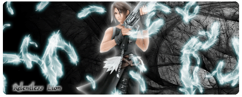
This is, in my opinion, your best work because it blends nicely, the color scheme works. The glow is a neat effect as well that distracts from the blending. There are still places it could be improved, such as the background could use a little more "action", but I've never used CS2 so I have no clue what you're working with anyway.
The major point is that I like that sig a lot. Good work.


 beautiful colours and that background is amazing.... u blended it in very well... only thing is that it needs a border apart from that great work keep it up
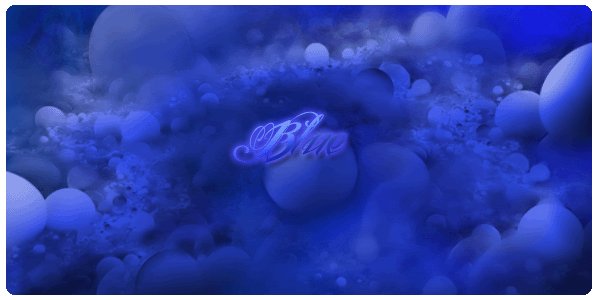
  My advice would be to make them a lot smaller; when they're too big they tend to have a lot of extra space that distracts from the focal point
  That and your font choices could use some work
 ")
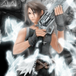
 It just looks like a cut out to me.
 And the yellow part over it... I'm not really sure what it is


