Yumiko's Graphics Dump (*warning* very image heavy >.<)

Yumiko

Glamorous &#10084;
Joined
Jul 3, 2009
Messages
195
Location
Cali
Gil
0
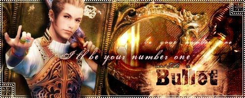
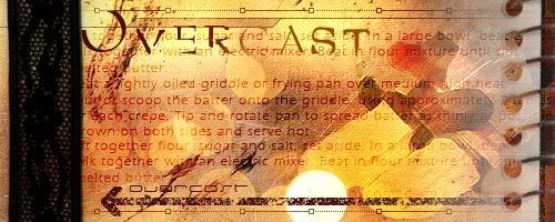
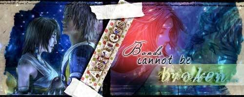
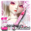
Basically this is exactly what my title says it is, hahaha. My little graphics dump x3

Signatures.Signature Requests

signa.png


metalcalow.jpg


overcast2.jpg


overcast1.jpg


asianess.jpg


sig.png


loli-sig.jpg


magic.jpg


bbyd.jpg


sbi.png


nyanko.png


Avatars

wy.png
db.png
radio.jpg
avi-2.gif
avi-4.jpg
nyanko-cake.gif
stitch.jpg
avi-1.gif
avi.gif


Random Banners/BG/Graphics

0-1.jpg

numerodos.jpg

2-1.jpg

numeroquatros.jpg

3-1.jpg


header-2.jpg


enchanted.jpg


BG links: <a href="http://i24.photobucket.com/albums/c21/fuhenkaimei/kathybg.jpg">[x]</a>

 
Wow, this is really awesome, Mei.

I think your strength lies in composition...I mean, just take a look at it; every piece seems to be creatively put together using a plethora of images. It's obvious you put a lot of thought into your graphics and how you arrange everything to either bring out emotion or life to your tags, and that's really admirable. :monster:

I like how you can combine innovation with aesthetics. Very strong works. Can't wait to see more. :monster:
 
Wow, you have a very different style from anything ive seen before, i really like it. I agree wih waarbs, your definately great at placing stocks into your tag, they all fit and look the part. Great colours aswell and your text always seems to relate to the signature itself, i really like that. My favourite would be the strawberry one, love the blending.
Please keep posting your work, i wanna see more =)
 
If I could make intercourse with your texturing skills and intuition for synergy with color, ideals, and font selection, we'd have little photoshoplets running around everywhere, painting and texturizing the art world with undiscovered hues of talent and graphical savvy. I can't express how epically awesome your choice of themes, stocks, and color coordination is. I can only say if I had as much graphical talent that you do in a piece of a thumbnail you'd bite off and flick into the air, out the window, while in a car, I would be an a more popular GFX clan than the dying and desolate wastes of The Illuminati.
 
i HAVE to post again, i have to say gratz yumi, your probally the best gfx i have ever seen, and that saying something, you should feel very proud lol.. here is a link to my request, think you could take a look ? i LOVEEE your work, pretty much if you want ignore most what i said about sections ect and do what you feel would look awesome, mabie something along the lines of the Colorless sig you done
 
Your work reminds me of actual artwork - almost like a scrapbook or something, and that's very unique to see in signatures. I really like it. ^^ You have a special talent and I know you can only get better and better at this, so keep it comin'. I'd love to see you enter in SOTWs and AOTWs one of these days...your work is just aesthetically appealing and the way you pieced everything together is quite the creative way of doing it. Avatars are also awesome. ;)
 
Thankies! I'm glad you guys like them x3 a few of them are done two or three years ago. >.< Ganja, I'd be more than happy to make something for you, but I'm not sure I see a link in your post leading to your request.
 
I can has Balthier set? :gasp:
Do anything you want, any stock you wish, and include any other characters in the stock, use any items you want too. I know it'll turn out as epic if not more than the latter tags and icons.
Set = avatar + Sig
 
Yes sir you can has a Balthier set :-) PM me about details if you would like. ie: Certain image/color scheme/added text/signature theme. Once finished, I'll post the result here and if you would like for me to make any changes, PM me and I'll post the updated set here as well.
 
WOW, thanx a hell of alot for that, its amazing, better than i would have hoped :D.
i gotta get off comp but ill give you a proper thanx tomoz :D lol
 
Thats cool i like that alot. The way it appears as if the image is being revealed by the zipper. Definately creative. On top of that i love the colours and the text. What font is that? Excellent work, only thing im not keen on is the white border, i think a darker colour would be nicer ^^
 
Thanks for the input, I actually was going to give it a black grunge border, but decided against it since I tend to overuse grunge borders, hahaha. But yeah, I think a solid darker border would work better as well. Aaand the font I used is Copperplate Gothic Bold (´・ω・`)
 
Inspired by my favorite magazine - Koakuma Ageha (´ε`)
Model - Saku Rina

sakurina.png
 
Back
Top