So, as I pray-

So yeah, this is my GFX Gallery. I've managed to obtain CS4 on my laptop, so now GFX is easier to do. I'm a GFX Newbie, but I'm actually pretty good! And yes, the UBW picture above is made by me XD Archer FTW!
SIG I: Misaka Mikoto (To Aru)
First sig I made with CS4.

SIG II: Reimu And Marisa (Touhou)
This one was made quickly, but it's still a pretty cool sig.

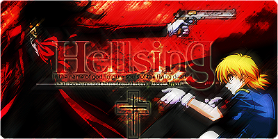
SIG III: Hellsing
For a Horror-themed SOTW on some other forums. I LOVE this sig, but it's hard to look at and has too much motion blur...
SIG IV: Lelouch & C.C. - Code Geass
I used some blending and some Brightness&Contrast with this one. I think I should've used some Lighting Effects as well...

SIG V: Bazett Fraga McRemitz (Fate/Stay Night)
Smudging, motion blur, blending, contrast. Wasn't very hard to make this one. But I think I did a good job. There's still a lack of any brushing or C4Ds - I'll try to learn more about that...

SIG VI: Rider (Fate/Stay Night)
Done in a similar way to the Bazett sig, with a few differences.

SIG VII: Hatsune Miku (Vocaloid) and Yuki Nagato (Haruhi Suzumiya)
Made with a render of my own! =D I used a C4D to darken some parts of the BG, but that's all I did with it... Nonetheless, it's hawt

SIG VIII: Noel Vermillion (BlazBlue)
First attempt at using C4Ds. I used... three C4Ds, all set on Lighten >.> I didn't smudge or erase anything, so it's a bit cluttered, but hey, it's my first try!

EPIC SIG IX: Roy Mustang (Fullmetal Alchemist)
This sig is rather awesome. It's definately my best sig so far...

SIG X: Hazama (BlazBlue)
Don't have anything to say about this, other than the fact that C4Ds + bevel effect = awesome.

SIG XI: Yoshiya "Joshua" Kiryu (The World Ends With You)
Originally created to be complementary to my Sho Minamimoto sig, but unfortunately I made it before I noticed the new sig rules.

~MORE TO COME~
Please comment on my skills...
So yeah, this is my GFX Gallery. I've managed to obtain CS4 on my laptop, so now GFX is easier to do. I'm a GFX Newbie, but I'm actually pretty good! And yes, the UBW picture above is made by me XD Archer FTW!
SIG I: Misaka Mikoto (To Aru)
First sig I made with CS4.
SIG II: Reimu And Marisa (Touhou)
This one was made quickly, but it's still a pretty cool sig.
SIG III: Hellsing
For a Horror-themed SOTW on some other forums. I LOVE this sig, but it's hard to look at and has too much motion blur...
SIG IV: Lelouch & C.C. - Code Geass
I used some blending and some Brightness&Contrast with this one. I think I should've used some Lighting Effects as well...
SIG V: Bazett Fraga McRemitz (Fate/Stay Night)
Smudging, motion blur, blending, contrast. Wasn't very hard to make this one. But I think I did a good job. There's still a lack of any brushing or C4Ds - I'll try to learn more about that...
SIG VI: Rider (Fate/Stay Night)
Done in a similar way to the Bazett sig, with a few differences.
SIG VII: Hatsune Miku (Vocaloid) and Yuki Nagato (Haruhi Suzumiya)
Made with a render of my own! =D I used a C4D to darken some parts of the BG, but that's all I did with it... Nonetheless, it's hawt
SIG VIII: Noel Vermillion (BlazBlue)
First attempt at using C4Ds. I used... three C4Ds, all set on Lighten >.> I didn't smudge or erase anything, so it's a bit cluttered, but hey, it's my first try!
EPIC SIG IX: Roy Mustang (Fullmetal Alchemist)
This sig is rather awesome. It's definately my best sig so far...
SIG X: Hazama (BlazBlue)
Don't have anything to say about this, other than the fact that C4Ds + bevel effect = awesome.
SIG XI: Yoshiya "Joshua" Kiryu (The World Ends With You)
Originally created to be complementary to my Sho Minamimoto sig, but unfortunately I made it before I noticed the new sig rules.
~MORE TO COME~
Please comment on my skills...
Last edited:


