I'm not sure if any of you have given it any real thought, but it's a little something I've always used.
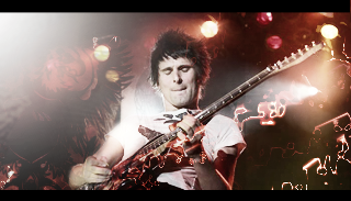
A few examples of my signatures that are largely based on this particular approach as are follows;

this particular image revolved around a lot of image application and filters, but on the side there is a tattoo worn by Frank Carter (Gallows, go check them out dammit). the hole in the wing is his nipple

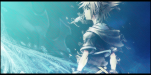
For this one, I took that really popular BBS scan and manipulated it a lot and set a blend on top that made the metal on the masked boy's helmet stand out.

Because I've been out of it for so long, I've been relying on what I know what to work with best. This particular signature had very little use of actual tools and just blending layers and erasing.
since i suck at text i nabbededed a magazine cover with that shit on it
I don't know how many of you actually use this approach to making signatures, but I didn't think it'd hurt to share or make some people aware.
A few examples of my signatures that are largely based on this particular approach as are follows;

this particular image revolved around a lot of image application and filters, but on the side there is a tattoo worn by Frank Carter (Gallows, go check them out dammit). the hole in the wing is his nipple


For this one, I took that really popular BBS scan and manipulated it a lot and set a blend on top that made the metal on the masked boy's helmet stand out.

Because I've been out of it for so long, I've been relying on what I know what to work with best. This particular signature had very little use of actual tools and just blending layers and erasing.
since i suck at text i nabbededed a magazine cover with that shit on it

I don't know how many of you actually use this approach to making signatures, but I didn't think it'd hurt to share or make some people aware.

 They just felt easier to work with
 . I have to practice the technique though. I'll use this thanks!
