SOTW 36 Voting Thread

SOTW 36


  • Total voters
    13
Status
Not open for further replies.

Daenerys

The Last Dragon
Veteran
Joined
Nov 26, 2006
Messages
11,178
Age
33
Location
Suburban hell.
Gil
1
This week I received 2 entries, the theme was free but you had to work together with someone else.

1)
lulu3-1.png


2)

BMWM3NFScopy.png
 
No.1 I guess!
I guess I like the effects more then anything in the sig, especially that bright light towards the left of the sig. That's really nifty :)
 
#2 for sure. I absolutely love the effects. Especially the blue clouds, although I thought the one on the right was a bit odd. Also, whoever's idea it was to make it oversharp I thought tat was a great touch.

#1 for me was just a background wit a render slapped on top of it :S.
 
This was hard seeing that we only have two choices this time, yet I have chosen 2# after much deliberation. Now my review about both signatures.

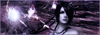
Entry # 1: As I have said countless times when I saw it earlier on another thread, it lacks color, it is too purple, aside from having slight blue, black and gray effects. The stock simply does not fit, seeing that I see no connection between background and stock. Her face (Lulu's) shows her like calmed, while the background is fitted for a more aggressive character. Though the sig looks good, the fact that it had very little colors somehow made me dislike it. Maybe if the stock chosen instead were of Lulu casting a spell, I guess I would have consider voting for this one instead.


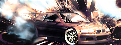
Entry #2: Though this one wasn't far from the first, it did have a few points in its favor. First it has better lightning and stock positioning, though it remains to have little colors, it did had more than the first.


Well I guess it must be harder to work in teams...I don't know for I have not wished to participate in the team competition, hence my lack of knowledge in the matter.
 
Even though I love the character Lulu, I had to say I loved #2 better.

#1 looked like they just put Lulu's picture on a flashy background.

#2 on the other hand actually looks like the main focus of the picture is a part of the picture. The effects, especially the smoke, looks really nice and looks like much effort was put in. Good job
 
I guess I'll go against the grain and vote for #1. The second one just annoys my eyes, for I am a fan of simplicity. I think Lulu could have been a bit less purple (lighter), but I like the effects and all of that junk.
 
Both entries were pretty good but the clear cut winner is Sig #2.

Sig #1 Little color, purple throughout. Nice background, but the render wasn't blended into it.

Sig #2 Very nice. It seems as if smoke is emitting from the back tires. It's a little over sharpened and also has little color, but is blended with the background nicely.
 
Number 1, I like the effects and how it's been done with the bright light and the darker purple. Good job.
 
I know that the rules were recently updated and most people don't pay attention to them, but I'd like if some of you paid them some attention, as you actually have to post in this thread if you want your vote to count. :wacky:
 
I chose number one. The way lulu looked in the background suited her. With all of the purple around her created an ominous feel to it, and shows lulu's 'hidden powers' perhaps?

I would of chose two if it weren't for that droplet looking thing on the left side of the screen. It's supposed to look explosive and fiery, not 'watery'.
 
Just by one vote, the winners of this SOTW are myself and Mugen.
 
Status
Not open for further replies.
Back
Top