Navigation
Install the app
How to install the app on iOS
Follow along with the video below to see how to install our site as a web app on your home screen.
Note: This feature may not be available in some browsers.
More options
You are using an out of date browser. It may not display this or other websites correctly.
You should upgrade or use an alternative browser.
You should upgrade or use an alternative browser.
SotW 232 Voting Thread.
- Thread starter Six
- Start date
- Tagged users None


- Joined
- Feb 18, 2011
- Messages
- 3,050
- Location
- In another Palace stealing Hearts.
- Gil
- 8

- FFXIV
- Kuro Narukami
- FFXIV Server
- Lamia
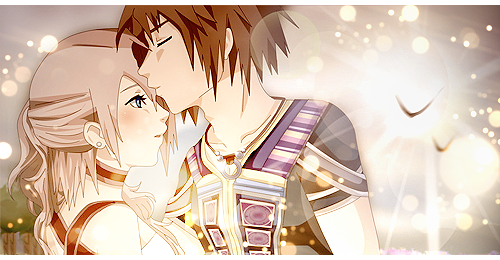
#1 for me I love the NoelxSerah pairing now xD, and I love the artwork used and how its blended in so well, loved everything about this one  !
!
#4 would have gotten my vote if #1 wasn't my favorite XD #4 is so cool yet beautiful
Wish I could vote for them both D:
!#4 would have gotten my vote if #1 wasn't my favorite XD #4 is so cool yet beautiful
Wish I could vote for them both D:
2 for me.
I don't know what it is here that just appeals to me. It's different from most signatures that follow the rule of thirds and are faithful to realistic lighting. I think it could've been better blended, but the creator took many risks visually (which to me, really works), and I think that deserves credit.
I don't know what it is here that just appeals to me. It's different from most signatures that follow the rule of thirds and are faithful to realistic lighting. I think it could've been better blended, but the creator took many risks visually (which to me, really works), and I think that deserves credit.
Voted for #2. 
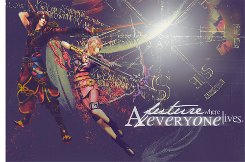
I like the text and the attempt at a space / time theme. Its not easy to do, I give you props for trying. This piece may not have came off as well as you would have liked, but if you keep trying maybe you'll nail it eventually & it'll be amazing.
I like the text and the attempt at a space / time theme. Its not easy to do, I give you props for trying. This piece may not have came off as well as you would have liked, but if you keep trying maybe you'll nail it eventually & it'll be amazing.
Honestly, I like the simplicity of #1 the best. The lighting is perfect to capture the mood, the characters stick out just right, all around good job.
#2....it's good, really, but there's a lot going on in it and I don't know where exactly I should focus.
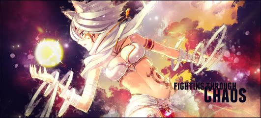
#3 I do like what you were trying to do with the lighting, but the text kinda bugs me. it looks like it's just stuck in the middle, like a last minute addition.
#4 Beautiful blending of your render, and the background is beautiful as well. It was a tough debate between this one and 1, but just the sweetness and simplicity of 1 ruled out in the end.
#2....it's good, really, but there's a lot going on in it and I don't know where exactly I should focus.
#3 I do like what you were trying to do with the lighting, but the text kinda bugs me. it looks like it's just stuck in the middle, like a last minute addition.
#4 Beautiful blending of your render, and the background is beautiful as well. It was a tough debate between this one and 1, but just the sweetness and simplicity of 1 ruled out in the end.
Congratulations to Lirael for winning this Sotw!
1. Stevie
2. Sabriel
3. Afterglow
4. Lirael (winner!)
Shu, Mitsuki, may I have this closed & archived?
And these guidelines archived as well: Linky.
1. Stevie
2. Sabriel
3. Afterglow
4. Lirael (winner!)
Shu, Mitsuki, may I have this closed & archived?
And these guidelines archived as well: Linky.