As much as I didn't want to post it, here is SOTW 11. Only ywo entries once again :\
1.
2.

1.
2.
Follow along with the video below to see how to install our site as a web app on your home screen.
Note: This feature may not be available in some browsers.
Bah, this is getting irritating...(lack of sigs I mean).
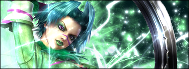
Anyway, I like both this week =o! But number 2 won me over in the end. I liked the coloring (and the smudging going on in the background?)
Both are hawt though <3
ORLY? Time for some experimentations then %DCan't remember exactly but I think it was an applied image, with a ripple filter, then moved down to the bottom and set on some blending mode.
Neither me.Can't remember exactly but I think it was an applied image, with a ripple filter, then moved down to the bottom and set on some blending mode.
")


