SKX Creations...

lalpromain-2.png

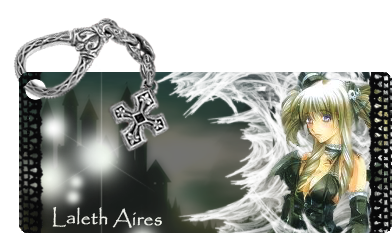
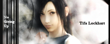
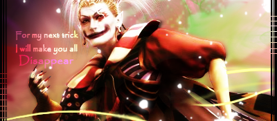
I think you did good with the pop out part of the signtaure. It looks neat and tidy.

The border looks interesting and different from what you usually see as well. =)

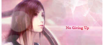
The main thing about this signature that I think could be looked at is the lighting and the colours. It feels a little dull. I think Laleth could have had a little more lighting drawn towards her as well, just to make her stand out a little more.

Other than that good work!
 
Thank you Kandy ^_^

Fresh new batch

I don't think SOTW matters now that the voting for the second one has started right? I'll just post it here anyways.

flow.png

tifa-1.png


tifa-2.png


lightning22.png


revi.png


I think I'm getting better with practice ^_^
 
flow.png


O_O YOU did THIS!?!?
wow, haha. I actually thought Kira did this :wacky:
The colors are perfect for this, and the balance between contrast and brightness is perfect. Though the glow on "flowers" is a bit off. Now, if the font color was white, and the glow brightness was lowers a tad, it'd be pretty swell :3
 
  • Like
Reactions: Six
crucifyme.png


This one is actually pretty cool. I'm not too sure if the text should be there up high in the corner like that. The lighting is good, and I like the light-dark half/half thing you have going here. I think in parts, it's too bright, but that's probably part of the concept you were going for :lew:
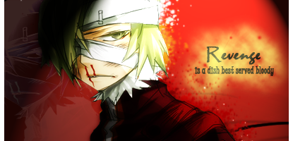
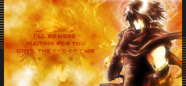
. So, overall, I'd say it's a good tag, but the text is just too much--literally.
 
crucifyme.png


Love the signature, the text not so much... You know the saying :lew: And I think it's every graphic artist's fear 'Text can either complete or ruin your tag'. However, I don't think it ruined yours, but I think it definitely would've been better without it. I'm not sure about the split text either, on each corner. That might've worked for a large piece, but... I dunno. Either way...

Love the effects. The bright white side looks absolutely stunning, and the dark side has a really posh feel to it. I just really like the playful look the tag has. :lew:
 
Thanks LG and Kira! ^_^ The stock is from a new CD and believe it or not the CD was titled "There is a Hell believe me I've seen it, there is a Heaven lets keep it a secret" so I just included the name of the CD because I liked the way it sounded although the text did not seem to work out any othr way. I could have left it out but it would have felt empty to me XD. Thanks for the adviiiiiiiiiiiiiice!
 
Back
Top