♣ • .:Castles Made of Sand:. • ♣

The lighting for the Torres is amazing. The upper right corner looks a little empty though.

I like the effects you've used on the Mario one too. The lighting is good in that one too.
 
That Torres sig is really really sick.

Not so sure about the Mario one though. A bit monotone, don't like the big white lines, some of the brushes just seem a little messy/random.

But really wow that Torres is a fantastic sig.
 
Torres one is pretty cool. The whole light effect surrounding him is a bit over-dramatic, but that's just me. Cool effects though. xD

Mario's pretty awesome too. I like the background theme and colors.
 
Last edited:
20uz4mb.png


Well I was bored the other day so I decided to make a Versus XIII siggie. Although lack of inspirations and boredom don't go well together :dry:
> Top - Original Stock
> Middles - Sepia Version
> Bottom - Black and White Version

...Comments...

PS. Thankiees for the comments on the other two sigs. :wink:
 
I really really really like the sepia version better. Good work! I like the kanji in the right side, and the effects are really awesome.
 
L i g h t ♥;333240 said:
The Mario one is decent, but it looks washed out, and the text placement is not too great.

I agree, it was once of those sigs where you have no idea what you want to do so you start sticking random things everywhere >_<

Aqua:

2m5f5zt.png


I likes it but open to criticism :neomon:
 
L i g h t ♥;335640 said:
That happens to me a lot. XD


This one is good. I just recommend lowering the "fear of falling" text.
Noob question :panic:
Lowering as in move down or the opacity? >_<

...and danke :neomon:
 
Its been moved down :neomon:

Now for the Mewtwo sig...

2r26gzb.png


I don't know how far people want me to move Mewtwo/clipping masks to the right (I did read the suggestions :wink:)...or not at all?
 
Last edited:
Ooh that Mewtwo one is really good. I like the colours in it and the glowing around his hands, and the lightning in it. I just love the effects overall! Nice work. ;D
 
Oh well I found my old sigs a couple of days ago from back when I was modding FFS (late 2006/early 2007)....starting from oldest to newest...bare in mind that my computer has has several wipes since then I can't edit them.

XIIIVersus.png

Final Fantasy Versus XIII (1st one ever!!!)

Cruisev2copy.png


Untitled-2v2copy.png

(Including her signature :gasp:)

jessicaalbacopy.png

-------
So now the embaraassement it over...

TomCruiseSoTW.png

Font changed from that of SoTW entry.

Version-2.png


So like...yeah, comment and such if you wish too! :neomon:
 
Your work is magnificent! Even when you were a so-called "beginner", sheesh, those are some pretty neat stuff. The last two are my favorites, of course. xD I especially love how you did the 2nd Tom Cruise. The text placement seems a lot better from the original one as well, although I think his face on the bottom-left corner is still a distraction.
 
Thanks ^_^
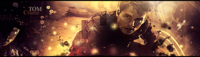
, I might see what that Tom Cruise sig looks like without the face in the bottom corner when I can be bothered opening up Photoshop xD

I'll personally admit this isn't as good as some as my other ones, but then again, I was going for colour and light over fancy effects to make it look more sexy...in a way. :wacky:

EvaLongoriaxxx.png


I also demand my thread title is changed to "~//*My Creations*\\~" :gasp:
 
Last edited:
You're right it's not good as the others since I think you've overdone it with the brush >.>
 
Back
Top