Nero's Old GFX

NeroTrinityX

NANI?!
Joined
Feb 24, 2011
Messages
274
Age
38
Location
Thibodaux
Gil
4
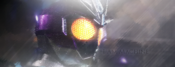
I haven't done GFX in a year full time, you know... work a full time job, and dedicate a bunch of time to my LDS Church... so, I figure I'll post some stuff...


ChaserSig.png


CaptainAmericaSig.png


ChaseSig.png


OOOSTTBAva.png
OOOSTTBBanner.png
 
Awesome work! My favorite is definitely the Captain America sig. If you have some more work you should definitely post it up!
 
Your title doesn't really make much sense if it's your new graphics, does it? =P

The Captain America signature is the only one that is well balanced in colour and positioning, in my opinion. Really like that one. It's good you're getting back into this! Hope to see more soon!
 
Your title doesn't really make much sense if it's your new graphics, does it? =P

The Captain America signature is the only one that is well balanced in colour and positioning, in my opinion. Really like that one. It's good you're getting back into this! Hope to see more soon!

For that one, I felt like the colors hit well, I was trying different things at the time and I liked the outcome... other than the two Chase banners, it's the newest thing, As I said I'm still trying to lock myself in, and get the hang of it again, which takes time. But I'm going to have a bit more soon!
 
AngelBeatsSig.png


Great signature. Gorgeous colours, the light source is spot on, good flow of effects, and I think it was a good call to leave out text. Text can usually make or break the piece so this was your safest bet. My favourite signature from you by far.

KainSig.png


Again, great work. I think the you could've eased up on the white light coming from the bottom of the signature to make it look more balanced. It's a bit too much for my liking. The light source from the top looks great as it actually looks "believable" / shining down on him. Particles and effects look great. Big fan of them myself.

Keep up the great work. Definitely the better two signatures I've ever seen you do. :D
 
I have to agree with Six. The last two signatures are well designed. The colors choices are well picked, the effects on them are extremely cool and the light in them is well balanced. Your design skills are coming alive once again. Keep up the good work and focus on it. Soon you will be a master at designing arts.
 
Nice work!! love the colors and the softness it's got! looking forward for more :')
 
Thanks guys, I enjoyed making the Yuna/Tidus sig... But the Sice sig/avatar set I made didn't come out right... but meh, I'll post it

TidusXYunaSig.png


SiceSig.png
SigAv.png
 
Looks good Sice Keep it up. :D You've been slowly improving from being gone for a while it seems.
 
You are doing a great job for the little time you been practicing on your art skills. Soon you will be at the same level as you were before you left the community. Don't rush it, it takes time to perfect your skills.
 
Back
Top