Lew's GFX Priory

Status
Not open for further replies.
Originally Posted by Kandy Sugar

I love the texture of his skin! It's amazing! What is it? XD
IM not sure what you mean by texture. Basically i gaussian blurred an applied image then erased it around his main features. Then sharpened the eyes and head band thing.
For the colour i made a new layer put it on colour dodge. Filled it black then added in the orange with a soft brush. :)

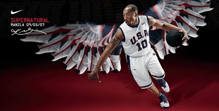
This is the stock i used for those backgrounds. Nike has some cool posters. I think the wings are made from the shoes hes wearing. Thats good photoshopping :gasp:
kobe_bg_sm.jpg
 
Last edited:
sotwentrygeishacopy.png


Love the vibrancy. The chinese(ithink?) text is nicely placed. The colours used in this signature are amazing. And the overall vertical theme was amazingly covered in this signature.

arctictagcopy.png


I love your border style. xD I've used them, and I must say it's really rebelious looking. I love it. I LOVE the colours you used here, the stock is nicely positioned. (Why does that sound wrong?) The only thing, is that I think the font is a bit too dull. Something more curly would've worked better perhaps.

lingsig.png


I HATE pink. But I love the feel of this signature. xD I think you did better than my try on B's request, than I did. Awesome job.

brianfurysig.png


I like this one. xD To figure those wings are SHOES. Creepy. Creepily well done. xD The stock looks awesome, and the colours work really well.

lingav.png
sotwentryaotwnaruto.png
brianfuryav.png


I like the Naruto... I think it is? Best. The vibrancy in your work always catches me eye. xD And I think it's used really nicely in this one.
 
Thanks Kandy and Kira =)
Small update

Jim morrison :ryan: Black and white image and it wasnt the best of quality.
jimsigcopy.png


Request
requestkira.png


requesair.png


emmasitext.png


singt.png
 
Last edited:
jimsigcopy.png


Awesome sig. As I've told you before, it matches your font colour surprisingly well. Not sure if it were your original intentions.

"So it does... I mean... It was planned..."
:wacky: Love the font you've used. :D


requestkira.png
\


:awesome: Harhar. Love this sig. The little rainbow behing the LockhartAvenue is fucking awesome xD rofl. It's so punky. :) Like I said, totally fits my MSN name "Colours". :D

requesair.png


AMAZING colours used in this! DAMN you for being awesome with colours, I can't stop drooling over the burst on the right, so damn pretty! It's so vibrant! Please tell me how you make it look so vibrant?! :gasp:!!!!!

emmasitext.png


Saw this request, you had that done fast. I prefered the version WITH text as well. Abosolutely love the colours, and thats coming from someone who's not fond of Orange/Yellow :gasp: Love the cute star brushes... xD

singt.png


Omnomnom.... Microphone... Singing, purple... What the hell else can I ask to like in a sig? xD Love this one, love the border, vibrancy, and stock. Only thing that might've been better if it had been different is the font perhaps.

Amazing work. Keep it up, Lew!
 

Considering this was originally black and white this one looks really good.

The colouring is lovely and the focal point is achieved well with the sides being darker and forcing us to focus on the image.

The lighting on his hand looks really good, in how it streams off in cloudy lines.

Love the font you've used too. It really suits the feel of the signature.


Very cute.

I love the colours in this one and the rainbows apparent throughout the signature.

The lighting could be a bit brighter in my opinion though.

The pain splatter brush or whatever you've used looks good and the arrows shooting up from the bottom look great too. It gives the signature a more playful feel.

The text is also cute and the black stroke around it helps it stand out more.

Great work!


Not too fond of this one to be honest.

It feels very dull. If the image in the middle was lit up more it would stand out from the background more and look more alive.

The background is already set up to help achieve this, with it being blurred and all, but the image seems to blend in with it due to lack of light.

The text is decent, but I'm not fond of the bottom line of text. It think that the pink and red don't really match that well.


Lovely work on this one!

The warm colours work extremely well with Hermione and I adore those feather, love hearts and stars brushes that you've added in the background. It looks simply stunning!

The lighting is gorgeous and the blending of it all looks fantastic!

The text is lovely and the border rounds it off nicely.


Oooh very sexy. XD

The image is well lit up and I like how the text goes with the flow/angle of the microphone.

I like those little colourful lines you've got surrounding her face and the little balls of light.

The light coming from the bottom right hand corner works well and makes it look as though that's the source of light which is shining onto her face.

Lovely half border rounds it off nicely.

Keep up the great work!
 
Thanks Kira and Kandy =)
Small update

Just made this one this now. Thikin i should maybe darken the edges a little :hmmm:
jokersigcopy.png


Request for kelly. I wish i saved the psd so i could change the text -__-
riddicksigblackandwhite.png


Another request i think it looks really unfinished.
glorytag.png


And sotw entry. I was dissapointed with the lighting on this tag. After looking at it in the thread i could tell straight off it was way off >_<
raidensigcopy.png
 
jokersigcopy.png


:gasp: I've had my share of poker/cards/dice in siggies the past time as well. :) Seemed like there was a need going around to have something involving either dice or cards. :gasp:

The text is placed nicely, even though the render is a freak. I find him rather scary to be honest.... =X The little row under the text with him in, only made me have one thought: WHY IS THE SCARY ASS IN THIS SIG TWICE?!

Love the border, and colours you used. Looks like a simple sig, (which I'm sure it wasn't to put together) but it looks nice. Prefer this one most out of the whole update.


riddicksigblackandwhite.png


I'm not too fond of this one. I'm not a big black/white lover, 'cause I prefer colours, but the sig is really nicely made. The text is what I like most about it, so I'm not sure why you'd wanna change that? :gasp: Love the border, the render is placed really nicely.

glorytag.png


I LIKE the sig? But I hate the colours. :gasp: Am I a hypocrit or what? :wacky: I just don't care for the pink, and lime green on her glove. I know that was in the original image, so looking at that you did a great job removing the text. The star brushes are fucking cute xD That's what I absolutely do love about the sig, the text is really nicely placed as well.

raidensigcopy.png


I voted for this one. -__- You're winning too much in SoTW... xD The vibrant colours stood out most for me, and the text was nicely positioned for the sig. I would've prefered an uneven bored to be really honest though.

Update soooooon.

I'ma go put in a request for you. :)

Edit: I want an answer on this. -__-

Is it just me, or are your sigs getting bigger each time? :wacky: rofl. Not that I'm complaining, you use the space you have really nicely. :D
 
Last edited:
Edit: I want an answer on this. -__-

Is it just me, or are your sigs getting bigger each time? :wacky: rofl. Not that I'm complaining, you use the space you have really nicely. :D

Hahaha your correct they are getting bigger each time. That joker sig was :hmmm: 400x180. I remember i used to use 370x130 ALL the time and a few weeks ago i tried making a sig on that size of canvas and it was WELL hard it felt like i was making an avatar or something.
I like big canvases :grin:
 

This one looks awesome!

I love the image you used! It's so clean and makes the signature more lively.

The colours match well with the characters personality in my opinion and the lighting looks great!

The darkened edges at the top force you to look in the centre more which is good and the text is good, but it is a little hard to read.


Vin Diesel actually looks pretty hot in this one. XD

I like the black and white theme and the blending of Vin into the effects and background.

The lighting looks great, especially on the sides of his head.

The text looks really good and I think you chose the fonts well. =)

The border finishes it off nicely.


This one is cute but I think it looks a tad too dark over on the left and makes it seem a bit dull.

I think the lighting all over should have been the same as what's on the right. This kind of image is vibrant and girly and needs more lighting in my opinion.

The little star brushes look really cute and work really well. I like the bright little bits amongst the background as well.

The text is cute and fits in well but the overall signature does feel a bit empty in my opinion.


I voted for this one!
I liked the colours and the lighting in this one. The blues, green and yellows look great and the lighting makes them stand out brilliantly!

The blending is done very well and makes the character stand out, nailing the focal point wonderfully.

The text is also placed very well and the font chosen looks lovely!

I love the lines that are vaguely apparent down in the right hand corner on his sleeve near that splash of light and then also up a bit further on the left of his head.

Makes the image pop out a bit more.

Lovely simple border to finish this one off nicely.
 
Thanks Kandy and Kira =)

sotw entry
sotwentrydespaircopy.png


Request. This was bloody hard. I made 4 attempts at this sig after failing the 4th time i went back to my second attempt deleted a tonne of layers and ended up liking it.
Final fantasy leaves me so uninspired when it comes to gfx
rinoatagcopy.png


Quite possibly my favourite tag ever. I wanted it for myself D:
lowellsig.png


Another request. The stock image was awesome tbh

madwosesig.png


Probadly my favourite ever along with the solstice one. Focused more on depth and colour than blending. Besides if i blended him in it wouldnt look like he was overlooking the city. Alba is the name i go by on GFX forums

albav.png


Hmmm i didnt like the image so i was kinda uninspired when making it.
mlfytag.png


More of a bit of fun than anything really =D
winesigcopy.png


I wont post the avatars as theyr just crops of the sigs. AAAAAAAAAnd thats it :)
 
Last edited:

I voted for this one!

The whole colour theme and the image is very fitting for the theme and so too is the font.

The lighting is brilliant and makes it look as though the person is sinking more into the darkness.

The detail in the background looks great and the dark border closing in finishes it off nicely.


This one is quite pretty!

The colours match with Rinoa very well and the effects in the background look okay but a tad too much in my opinion.

I don't really like those red specs floating over Rinoa.

The lighting is done very well and the text is nice too.


Oooh I love this one!

It feels very racy and the background looks awesome! The cool blue colours look fantastic with hints of red here and there.

The blending looks great and the lighting looks brilliant! I love the sharpness and glossy feel of this signature.

The text looks brilliant and the fonts chosen look graffiti like and work very well.

The border finishes it off nicely. =)


Very cute.

This one has a nice glossy appearance and I like the blurred background as it makes you focus more on the girl.

The stock is quite cute and interesting too by the way.

The black, white and orangey colour theme looks gorgeous and works well. Also that scarf of hers pops right out there.

I love the lighting and clouded area over the


Same comments for this one as the Solstice one.

The image you used looks awesome too! It looks like he's just flown down to the front of the signature. The background looks very futuristic like too.


This one is cute and I like the warm colours.

Though it does come across as a tad empty. I like how the image is sort of hiding in the darkness and the small bit of light shining down on her face.

The text looks awesome and that little heart added in looks great! I like how you've made the border the same colour as the bottom line of text too. It looks great. =)


Haha I laughed when I saw this in Kelly's sig.

I always seem to see her write something similar to this nearly every day on here. XD

The warm soft feeling looks fantastic and the text looks brilliant! I love the fonts you used. <3

I like how you've blurred background so that it focuses more on the girls face and text as well.
 
Status
Not open for further replies.
Back
Top