- Joined
- Feb 25, 2010
- Messages
- 3,732
- Age
- 32
- Location
- Southend, UK
- Gil
- 0
- FFXIV
- Yuno Mizuno
- FFXIV Server
- Lich
- Free Company
- Silver Lining
Hey guys... I really want to get good at this...
These are my first ever attempts at creating a signature.. I never even touched photoshop other than cutting and pasting pics Please feel free to comment about them and to give tips on how I can improve")
Soo to the pics
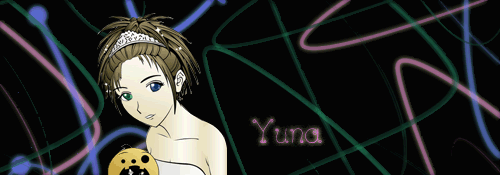
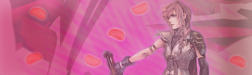
this was my very first attempt, I downloaded a font and use the default brushes to create a background... the image is of yuna
Yuna:
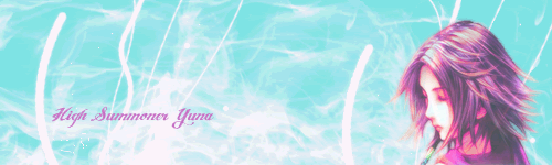
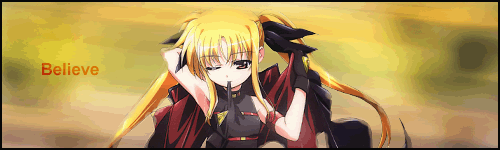
After that, I downloaded a brush and tried again this was the result
Noel Vermillion (Blazblue)
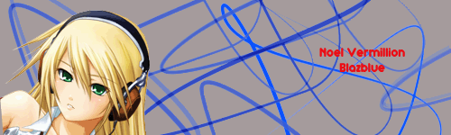
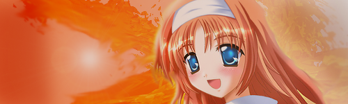
after that I tried again with another font and brush
Anime Girl with Lollypop

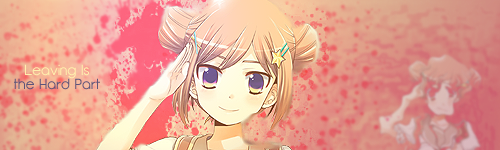
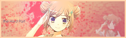
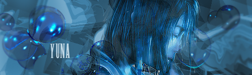
Finally after looking at tutorials for an hour I come up with this... I even rendered the image myself
Anime Yuna:
Again I would love tips and comments about How I could improve.. I would love to become as good as some of you guys
These are my first ever attempts at creating a signature.. I never even touched photoshop other than cutting and pasting pics Please feel free to comment about them and to give tips on how I can improve
Soo to the pics
this was my very first attempt, I downloaded a font and use the default brushes to create a background... the image is of yuna
Yuna:
After that, I downloaded a brush and tried again this was the result
Noel Vermillion (Blazblue)
after that I tried again with another font and brush
Anime Girl with Lollypop
Finally after looking at tutorials for an hour I come up with this... I even rendered the image myself
Anime Yuna:
Again I would love tips and comments about How I could improve.. I would love to become as good as some of you guys
 ...
...
 i dn.....
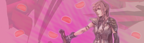
") What will it be, LY?
What will it be, LY?