Navigation
Install the app
How to install the app on iOS
Follow along with the video below to see how to install our site as a web app on your home screen.
Note: This feature may not be available in some browsers.
More options
You are using an out of date browser. It may not display this or other websites correctly.
You should upgrade or use an alternative browser.
You should upgrade or use an alternative browser.
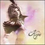
Lady Edea's Garden
- Thread starter Aselia
- Start date
- Tagged users None

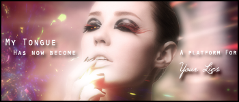
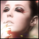
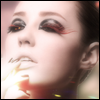
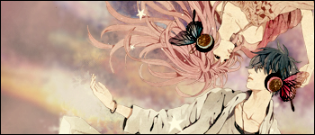
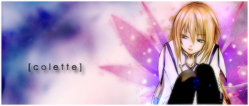
This set is really pretty.
I love the colours you've used. It has a nice calm feeling about it.
The blending is done really nicely and I like those swirly colours in the background.
Good lighting and the text is really pretty. <3
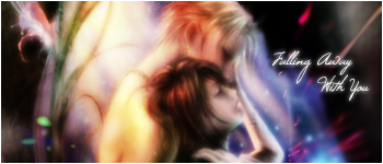
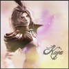
I think this one is blurred a little too much, but other than that I like it.
It has a nice hazy, dreamy effect about it.
The colours are really pretty and the font used for the text is gorgeous.
Keep up the good work!
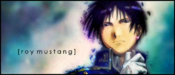
Wow, very nice work  I especially like the KOS-MOS/T-ELOS one below and the ones you did for Penelo and the Last Remnant. And I love all the blues and purples
I especially like the KOS-MOS/T-ELOS one below and the ones you did for Penelo and the Last Remnant. And I love all the blues and purples 


My newest set!
I really love this set, but I think the colour is a little TOO washed out. I know at first it was way intense, but I think you toned it down just a little too much. Regardless, it's still lovely. I love the blending especially and the avatar is yummy.
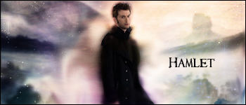
I like the blending and effects in this, it's a nice little set. It's showing development on your side, as you have more awareness of blending now, compared to, say, three months ago.
In contrast, I much prefer the avatars. The lighting and simplicity in the avatars is GORGEOUS. When it comes to the signature, I think too much text throws it off, and the random C4D/effect on the left hand side isn't needed.
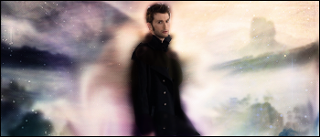
Again, I think I prefer the avatar here. I liked the original which was lovely and simple, before you threw all those C4Ds on top. I don't think the signature or the avatar needed them, it was lovely without them xD It's a case of putting too much stuff on one tag, but it shows a lot of development, even compared to the Hamlet tag, and the blending is much better.
Now THIS is the type of set I adore from you, it's lovely. I love the simplicity and the stock placement. I also adore the fact it has no text, as you're letting the tag speak for itself. I thing the colours are wonderful too. Among your best work, methinks dearie ^^
I don't think the text goes too well with it, but it's a lovely piece. Although, I have to agree with Kandy that it's far too blurry, but, this is especially effective with the avatar, it just throws the tag off.
I like this one too. I love the simplicity of it, and how uncomplicated it is. The lighting used is really good too. The avatar especially is really striking, but the tag is really good too. I'm glad you didn't add text to this piece, as I think that would ruin it. It's composed really well! Great job ^^
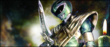
Nice and simple piece.
The background looks good blurred out as it draws your attention to the power ranger.
Not too sure about the candle on the right though.
Nice border, but I do think some text would spruce it up. =)
This is cute.
Nice and simple avatar.
It looks like some blurring was done in the background. If so good work. It brings your attention to the lady bug more.
Nice simple border to round it off.
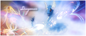
Nature AOTW entry:
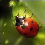
I vote for this in AOTW. One of the best pieces you've ever created, in my opinion, Amanda. I love the subtlety of the blurring and the effects, and the green really contrasts excellently with the redness of the ladybug ^^
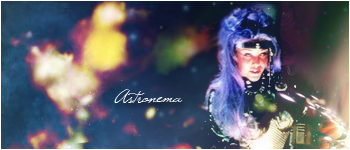
I think this is a huge improvement on your old Astronema set. It's much cleaner, and looks so much better. I'm not a fan of the text though, it sorta looks "slapped on" and the border would look better black, in my opinion, but overall, a huge improvement ^^
Last edited:
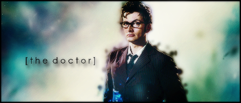
 Thinking about making an Aya set as well
Ooh, I LOVE this one Amanda. The blending and colours are really pretty, and I REALLY like the text too!
I like the size and placement too, one of your strongest works, I'd say.
I like the size and placement too, one of your strongest works, I'd say.
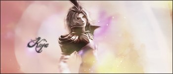
I quite like this one.
It's very pretty.
Nice and simple and I like the pretty little blue sparkles going up her legs.
The text looks neat too. I like how you've put brackets around it and cast a shadow.
Very nice piece. =)
Told ya I was gonna make an Aya set.

I like this set, very pretty. I like the simplicity in the background and the smudging. The text is nice too.
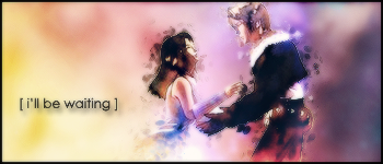
Saw a picture for the Prince of Persia movie and wanted to make a set of it.
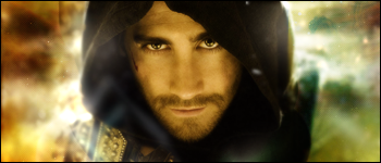
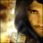
I think it works better as an avatar, with the sig, his face is too big to make it work, since the vast majority of the tag is his head. It works much better in avatar size.
Biiiig update
This was for a SOTW on another forum...
and I cut an Avvie from it...

and a bunch of other stuff...
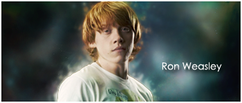
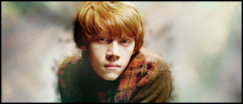
been on a Ron Weasley fangasm, but when am I not?


The middle set is definitely my favourite, very clean looking and your best work yet.
I like this new style, it's simple, but it looks effective ^^ Keep up the good work Amanda!

some more stuffs I made whilst babysitting
Babysitting makes for a perfect time to do sigs

This one is VERY pretty, I adore the colours, and the avatar is absolutely gorgeous. Very nice work here, Amanda ^^
With this one, while it looks nice, it feels like a bit more could have been added. Maybe it's the colours, but it feels a little empty. I love the text though, this new text style you're using is very effective ^^
I think you've over-used the smudging here slightly, it looks a bit messy, especially around their faces. I like how you've attempted more blending, and the colours are nice ^^ The text is cute too.