I got inspired by talking to a few other people yesterday and after like 9-10 years I made an attempt to create something of the gfx kind.
Behold my creation:
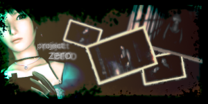
v1

v2

I am re-discovering GIMP and features I'd forgotten about, I even made my own brushes.
My conclusion: I have mixed feelings about this. There's something there that I want to express but I can't quite tap into it. The idea is there, the execution not so much. If you have any suggestions for the text (I like the color) to pop up more please do share.
Behold my creation:
v1
v2
I am re-discovering GIMP and features I'd forgotten about, I even made my own brushes.
My conclusion: I have mixed feelings about this. There's something there that I want to express but I can't quite tap into it. The idea is there, the execution not so much. If you have any suggestions for the text (I like the color) to pop up more please do share.
Last edited:


 I'm not very savvy with GIMP but I think it looks really nice. I like the white border on top & bottom too, it works with this signature! I think V2 is nice, the rose color watches more with the colors, but that's just my humble opinion.
 ")

")


 I tried a few other bat poses but they felt kind of distracting. maybe I should retry them...