Alright. I decided to finally try and get into GFX... *audience claps and cheers*
But seriously, I'm not that great and I hope to get better... But here is my very first GFX:

I have to say though, I did NOT do this on my own I had a lot of help from my boyfriend, some people on the forum, and whoever made the Carmen pic and the skyscraper pic. All I did was mess around on Photoshop
 ")
I'm gonna try and get better though... So feedback would be great!
More to come!
But seriously, I'm not that great and I hope to get better... But here is my very first GFX:
I have to say though, I did NOT do this on my own
I had a lot of help from my boyfriend, some people on the forum, and whoever made the Carmen pic and the skyscraper pic. All I did was mess around on Photoshop I'm gonna try and get better though... So feedback would be great!
More to come!


 Here's some of my advice anyway;
 But someone I've always thought to have amazing text placement is Big Casino and Oxide. They really are boss at it. Maybe you can look at some of their pieces and see if you can get a bit of an understanding for it. When I kept noticing I put font in totally weird places I ended up just browsing the "signature" tag on deviantart for hours, just trying to see how others did it so professionally. Sometimes looking at other people's methods of doing something is really the best option for beginners, I know it helped me. Just remember, you don't want your text to be at the bottom or very top of a signature all the time.
  it almost clutters the bottom half of the tag and we want to avoid that at all costs!


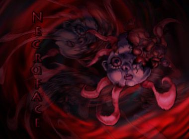
 . You made Necroface even scarier than it already was.
 You have some really cool stuff here, dude. I won't go too in-depth with criticising, because I'd only be repeating Hayabusa and Alex Mason. I really like your Ajani sig. You mentioned that you botched the lighting on it a bit, by which I'm guessing you mean the top right of the render.