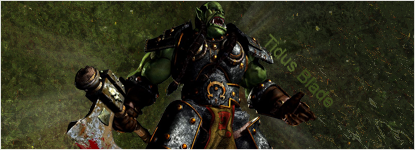
Heres the one i made for SotW #1, it's here for commenting

heres version 1

heres version 1
Follow along with the video below to see how to install our site as a web app on your home screen.
Note: This feature may not be available in some browsers.
")
 I like the simplicity, the render has a lot to it with all her arm guards and weapons so a more complicated BG would make the sig too crowded. I would erase the brushwork over her face, it's very bothersom [if that's even a word]. I would also lighten up the colours around the render so it blends better and then have the more darker tones towards the edges. Finally, the text It's very hard to get this right on this kind of sig so I would just down the white a bit, so it's just that bit softer. Other than that, good entry, you're improving rapidly =].. Again perhaps I shouldn't be commenting, but I quickly skimmed this thread yesterday and my eyes widened at your sig, because it's a huge improvement from anything else you've made. It's definately your best yet. Everything is brilliant, and the only thing you can improve on is the text [yes that sucker <.<]. I really don't know what you could do for it but it needs changing. The type of BG you have and the colours you've used make it difficult to have text done rightly on the sig. Personally I think you should have a more straight edged font to fit the squares and then just a lighter colour or something. Text aside, great job TB =D.
")