SOTW 203 Voting Thread.

SoTW 203 Winner?


  • Total voters
    14
  • Poll closed .
Status
Not open for further replies.

Warbsywoo

Hellodia.
Veteran
Joined
Apr 15, 2007
Messages
4,891
Age
35
Location
California
Gil
2
The theme for this week is: Harry Potter.

Here are the entries I received:

1.)
2zxo2zk.jpg


2.)
219doaq.png


3.)
3dxt5.png


4.)
HP.png


5.)
Untitled-7.png


Remember:
+ Poll closes in 7 days.
+ Entrants cannot vote for their own entries.
+ Although posting is not required for your vote to count, it is highly encouraged.

Good luck!
 
Last edited:
A Harry Potter themed SOTW :hmmm:

Different...yet cool I guess :dave:

Anyways...I voted 2. It was a hard decision because it was between 1 and 2 for me.

1) I really like the coloring and the detailing that went into this. The font is in a good place and doesn't dominate the sig. The effects are nice too...its just personally a little on the small side for me, I think it would've popped a bit more for me if it was bigger.

2) I ended up voting for 2 because the whole image is so clear throughout and the size is a little awkward, but it allows for Hermione to be proportioned well with the background. I like the subtle use of effects as well, with the gold complimenting the darkness of the background nicely.

3) The coloring just doesn't match very well for me with the black and the magenta...and it looks like a simple mirror image of itself. I do like the picture quality though...its very clear.

4) This sig threw me wayyy back in time...they were so young in this pic! I do like the text and the quote in it...I just think its a little on the plain side, for me personally.

5) Dobby :britt: 
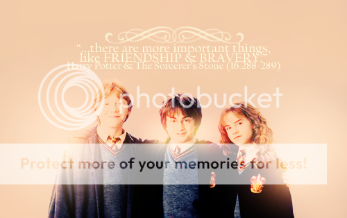
I like the shape of this sig...and the quality of the picture is pretty much perfectly clear. The text isn't obtrusive and is in a good spot. I just think its a little plain/could use an effect or two.
 
I voted for 2. I love the light right behind Hermione, and the effects just look really nice. :ryan:
My second choice was 1, but I think there's a bit too much going on. Still really good though.
 
Aww I wish #1 was working so I could see how it looked.

Anyway I voted for 5. I really like the crisp picture used and dobby is just so cute *sniff :(* I like the lighting and the text is really nice and fitting!
 
I voted for #5. It may look simple but I know how much work goes into making a poor image even suitable for a signature. I like the simplicity, lighting and border. That one side rounded corner thing is new and I really do like it. :wacky:
 
Congratulations to Ewan (Oxide) for winning this week's SoTW!

1.) Seiji
2.) Oxide (Winner)
3.) Thane Krios
4.) Coco
5.) Six
 
Status
Not open for further replies.
Back
Top