Ooooh i must say those signatures be sexy! I really like the color combos and effects you use! I've yet to play Fallout but maybe i'll check that out
Thanks much for the compliments

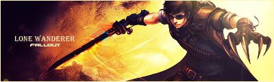
Alright here is another that kinda ended up the same as the last one.