~HysteriaN~
Ex-Soldier
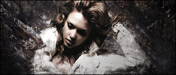
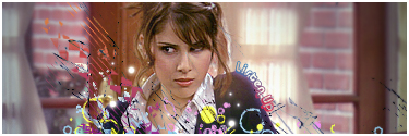
colored one is better imo, its a very nice sig, i love the text ")
Follow along with the video below to see how to install our site as a web app on your home screen.
Note: This feature may not be available in some browsers.
colored one is better imo, its a very nice sig, i love the text

I love it, great shading and such. Colours go well together.
Text wise, maybe a white font and perhaps her name in some dramatic font as it seems like a dramatic sig to me. Like the font Ive seen on some sigs that bends, like this one:
I didnt do this sig, but I was also wondering how you do the bending text. The text could go down the side of her arm perhaps?

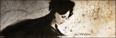


I like Bandrasses, both color styles.
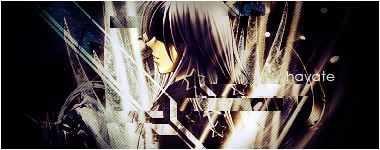
The first is like he is inside somewhere and outside of the window is raining and thats a light pole shining there and we are in the other side of the place and watching him from another window
Yellow/pink worked very nice out there
BW is cool enough
I have nothing to say about how to improve it. because I have no idea how to do it. You rock


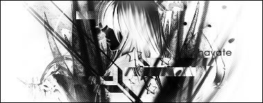
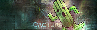
heres prob my newest. with 2 diff effects to it.
of course its for any one to post right XD
 I have a lot of time on my hands, staying at home revising.


") guess this is mine.
guess this is mine.