My Sigs!

Lirael

I love to read and discuss pretty much anything!
Veteran
Joined
Jul 17, 2006
Messages
2,904
Age
35
Location
United Kingdom.
Gil
0
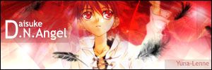
Been making sigs for a while now. Hope there aren't too many here. These are my favourites.
daisukesigcopy.jpg

dragonsigfirecopy.jpg

finalfantasy13sig3.jpg

immortalrainsig1copy.jpg

lifesigcopy.jpg

penelosig2.jpg

scenerysig22.jpg

siggie00copy.jpg


All these sigs were made using just brushes and a render, sometimes people think I just cropped images. :P I'm not very good but if you want me to make you a sig, PM me! ^^
 
DN Angel- the background gradient, is pretty good but the splitting point (when it turns white) dosent look too good. Render is cool and masking was nicely done.Feathers added a nice effect but the text dosent look very sharp. Awesome sig.
Dragon one- Background looks amazing with cliffs and such. The render looks AWESOME, and theres a good looking tiny render in the middle bottom of the sig, looks like a fire golem or something, still looks cool. The lighting isint too bad, it's pretty good as it effects both renders and shadows are formed. Text was much better here, looks sharp enough and the subtext with has no meaning looks good. This one is much better than the DN Angel one.
FFXIII one- Background isint too awesome, lightly brushed and such but the effects make it much better, looks like a party. some abstract at the bottom of the sig, looks nice. Render is really good but i think you sized it down too much so it's deformed. Text was good here. Really nice sig but the render could be improved.
anime one-
Pink background looks really good and effects on the left look cool, the butterfly is cute! The tree which i dunno why is there still looks nice but could have been bad, render is nice and especially on how the blending was done. Text is small and Lenne isint very readable, ill say that the worst part of it. Great sig just the text is not so good, dont worry text is really hard to master.
Anime Girl one- pink background is nice with white boxes but i feel that it is too light in some areas. Render is really cute!! The text looks good here but i still feel that it's too light. A really good siggy, gotta love that render!
FFXII one- Awesome looking background with all the lighted lines and stuff. The render is well blended into it and since it's in the middle, it might not turn out so great but here it looks great. Loads of effects and I love that, looks detailed and complicated. The Yuna-Lenne text was small again but at least it's readable. Serenity text is excellently blended and is much better than the Yuna-Lenne text. This is probably the best sig of the bunch.
Last one- Nice pink background/sky, looks really good. The shining sun in the distance looks good and produces a nice effect. The grass and flowers look so good even though it's just black, tree is also great looking there. The two people there looks romantic, I bet they're about to have sex. Text is pretty good here, readable and in a good place. Id say it would be about the second best sig there.
Current Shiva one- pretty awesome blue background. Stars looks good and the pentagons looks great there, nice effect. Sweet render with great blending. Diamond Dust text style isint so good, but the Yuna-Lenne text here is good and readable.
Conclusion- Your an awesome sig maker and i hope to see more of your work, Im sure you can make alot better stuff than this. And sorry if this post is too long
 
Back
Top