Large Art of an Internet Person (It's not good)

Zatchara

Chocobo Breeder
Joined
Aug 6, 2012
Messages
23
Age
36
Location
Failabama
Gil
0
There's expletives afoot, if that's not your thing. But hey, calm down..or whatever the
fuck
, because I've put the entire image in spoilers. I don't know if expletives are allowed to be seen publicly here, so...take solace in the spoilers if they make you uneasy.
Fuckin' expletives, man. Fuckin' curse words

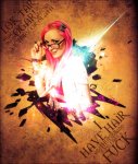
Onto the actual piece; It's not good. I'm not used to working with large art and as such, all that space was a bit of a leap from what I'm used to. As for the text, it's not random...they're actually quotes from the person featured in the tag, which is Danielle aka Panser aka TradeChat from the show King of The Nerds. So, now that I've made a myriad of excuses for why it sucks, I feel comfortable with posting the image now.
TC.jpg
 
i was honestly expecting some huge wall of every expletive known to mankind

i am disappoint :sad3:
 
definitely seen worse :wacky:
 
Lets keep in mind this is a post count section for displaying your graphic works, guys. Thanks.

Jokes aside, I think the piece looks nice. Some blending could be added to it, and maybe a filter to make the colours blend in a bit more, but I think the piece looks really nice actually. I don't know if you just started or not, but it doesn't look like starter piece, that's for sure. Some things could be touched up on, but like I said it's in no way looking like it's a first made piece.

Personally like the text, maybe drop the opacity a bit more to have it stand out a bit less, although it doesn't take away much from the original/colourful focal, I think dropping it a bit will make it look even nicer. Give it that faded look. =]

Nice work.
 
i didn't even realize it was their work, i was so tired last night

i actually thought they were ragging on someone else's work or something :monster:

the resolution is kind of so-so, but i don't think it's turned out terribly for one of your first attempts at an lp. I can't even remember the first LP I did, but I get the distinct impression that it was probably pretty terrible. If anything, I just feel like it does not have enough atmosphere. But it's quite alright.

Expletives should be fine though, I used to run around saying all kinds of shit here. but i think everyone would appreciate it if it was kept within reason. so as long as you don't go off on a tangent about cockjuggling venereal diseased whores, you'll probably be fine. You're Rick James, bitch! :wacky:
 
I found myself looking at your siggy more than the artwork itself! XD Anyway, for a small picture, it looks pretty nice quality wise. The creature in the pic looks pretty creepy as well. I like the background you pick for it too. It's reminding me of the scroll from the Castlevania game on the N64. Overall, I really dig it. :) but I dig your siggy even more.
 
Thanks for the replies~

Lets keep in mind this is a post count section for displaying your graphic works, guys. Thanks.

Jokes aside, I think the piece looks nice. Some blending could be added to it, and maybe a filter to make the colours blend in a bit more, but I think the piece looks really nice actually. I don't know if you just started or not, but it doesn't look like starter piece, that's for sure. Some things could be touched up on, but like I said it's in no way looking like it's a first made piece.

Personally like the text, maybe drop the opacity a bit more to have it stand out a bit less, although it doesn't take away much from the original/colourful focal, I think dropping it a bit will make it look even nicer. Give it that faded look. =]

Nice work.

I no longer have a PSD of this one, unfortunately. I've actually been messing around with digital art for about ten years, having started with Paint Shop Pro. Though, I should note I've been pretty inconsistent with it, so I'm definitely not an expert. It's mostly just a program I come back to every now and then for the hell of it. Funny you mention the opacity, because I did have it turned down at one point, but with filters, etc. I guess the text ended up looking darker. The biggest problem I've found that I have with large art is finding the right C4D's.

i didn't even realize it was their work, i was so tired last night

i actually thought they were ragging on someone else's work or something :monster:

the resolution is kind of so-so, but i don't think it's turned out terribly for one of your first attempts at an lp. I can't even remember the first LP I did, but I get the distinct impression that it was probably pretty terrible. If anything, I just feel like it does not have enough atmosphere. But it's quite alright.

Expletives should be fine though, I used to run around saying all kinds of shit here. but i think everyone would appreciate it if it was kept within reason. so as long as you don't go off on a tangent about cockjuggling venereal diseased whores, you'll probably be fine. You're Rick James, bitch! :wacky:

I thought of adding in random items to fill things in, but I didn't want to be one of those guys that just adds in spheres, etc. that don't contribute to the piece at all.

I found myself looking at your siggy more than the artwork itself! XD Anyway, for a small picture, it looks pretty nice quality wise. The creature in the pic looks pretty creepy as well. I like the background you pick for it too. It's reminding me of the scroll from the Castlevania game on the N64. Overall, I really dig it. :) but I dig your siggy even more.

Easy to get distracted when you have the best in the world staring at you. The creature? As in the person?
 
Back
Top