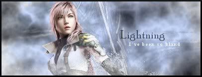
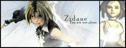
I really like this one.
You've captured the focal well in blurring out the background. The little splashes of light in the shapes of snowflakes look okay though I would move that one on Hopes hair just a little out of the way so it's not on him.
Good lighting and the text is placed well. I really like the font you used for hope and the small text underneath finishes it off nicely. =)
Nice border, but I can see in the bottom right hand corner that there is a little white square coming off the border, which I don't think is meant to be there. =P

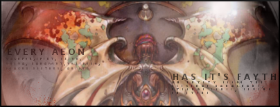
You've done a really good job on this one.
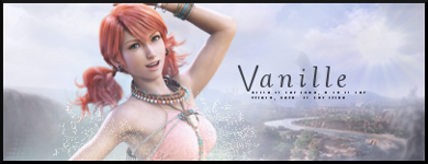
The blending is done very well, and I like teh light background around Vanille.
The lighting is well done and I like the cloudy texture of the background.
The text is placed well and the fonts are nice, though it is a bit hard to see amongst the white background.
Good work other than that. =)
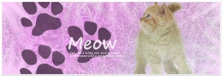
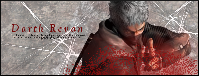
This one is cute.
I like the little cat footprints and how the text is over the top of one of them.
Nice choice of font too. It's playful and works well. =)
Cute background. THe texture sort of reminds me of twine for some reason, which goes well with the theme of the signature. =)