Kitty's corner

Bones

Invisible
Veteran
Joined
Jun 25, 2008
Messages
1,148
Location
UK
Gil
0
Ok I'm just starting out with this and some of this is from experimentation, but thought I would put a couple of pieces up and just see what you think.

brendonsig.jpg


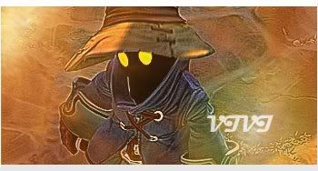
This is my first one, I'm a big fan of Brendon, as you could probably guess ^^ This one is quite simple so probably not so impressive, but I like it all the same :)

zidanesig.jpg


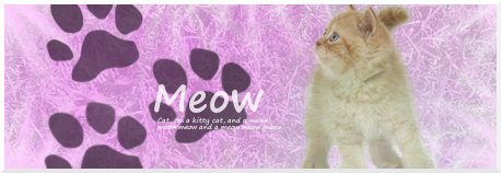
Ok, this is the one that I made from experimentation, god knows how long I was playing around with this for... but I think it turned out pretty good.

So what do you think?
 
Not bad at all. The colors and style are quite good for starters. The Zidane one I like more, but that's Final Fantasy biased XD. I did come out good and vibrant to me.

Just watch out for having more than one focal. Can make a piece seem cluttered and makes your eyes dart around for a place to rest.

Just look at some tutorials, but you are already decent now. I like them (y)
 
Thank you!! I love having advice given to me because I am always looking to improve :)

Anyway I have made another one, probably still need to work on the focal thing though :/

aerithsig.jpg


Meh The more I look at it the more I'm not sure about it >.<

And another Zidane one! Sorry but he's my fave :inlove:

zidanesig3.jpg


Last edited:
Well i'm not a pro at these things but they aren't bad :monster: I like the background of yer latest Zidane pic :) Just keep working at it! =) Arieth's isn't really bad but the right side just seemed a tad bit plain IMO and the color (on the right) is a little bright for my taste. can't tell if there's anything in the bg or something-- looks like theres something there but it could just be me eyes xD idk. Still good. Can't really say anything technical since i'm not so pro at this XD.
 
Last edited:
Yeah I thought that the Aerith one was a bit iffy when I posted it, but the more I see it the more it actually grows on me, I probably put a bit too much light in it I guess =/

Thank you for the advice, always helps :)
 
You've started with some good basic work which is nice to see, it shows progression. There's some font/text thrown in there, some lighting, clean renders and the blending of Zack in the Aerith sig that gives you a good platform to start with :)

I'm not going to try and throw hoards of advice otherwise you may end up getting confused, but now I'd try and thrown some colour layers in there and maybe some brushing of light and colour and/or general brushes. I don't really know where to go for tutorials since I don't use them but there might be some on Planet Renders you may find useful.

Keep up the great work and keep at it! :)
 
Thank you Mercurial, I will try and look at some tutorials in the next couple of days =)

Another couple to have a look at, both for Vanille, C&C would be lovely thanks :awesome:

vanillesig2.jpg


vanillesig.jpg


And...... another Zidane one, haha, been messing about with lighting and stuff on this one :)

zidanesig3-1.jpg

 
Last edited:
Sorry about the double post, but I have an update to add to my stuff!

I've done something different, this time it's Squall, hope you like it.

squallsig.jpg


What's your opinion?

 
This was great. I felt that the double image was a bit unnecessary, but you did fine anyway. Keep it up!
 

This one is quite nice.

It's simple and the focal is clear which is good.

Nice lighting and the lines around the border of the signature draw your attention to the centre more.

The text is positioned decently but I would suggest a more simple and professional looking font.

A border would finish this piece up nicely too. =)

I think that a bit more blending of Zidane into his surroundings would look better, but other than that good work!
 
Thank you for the comments guys, keep them coming!! ^^ It's helping me learn to get better! I'm trying to take the advice in so hopefully I'm not dissappointing you.

ttsig-2.jpg


Here is another one, I think I may have used a bit too much lighting but I messed around with text and stuff, and got this :)

God I need to find some different renders =/
 

Wow much better! =D

Great blending and the faded image of Zidane behind the main image of Zidane looks great! It doesn't take away from the focal at all and looks awesome!

I like the cloudy smudginess around him and the positioning of your text is great. Nice font too!

The one thing I would suggest is to move Zidane along with the text over to the right a bit more so that he doesn't look too shoved over to the edge on the left.

Those faded darker blue lines in the background look nice and add some detail. Nice lighting and nice and simple border to round it off.

Keep up the great work!
 
Yay! Thank you ^^

zack1.jpg


Another one, this time I used Zack, and messed about a little bit. Hope everyone likes it :)

And one that isn't FF related..

pwsig2.jpg

 
Last edited:
I'm really sorry about the double post but no-one has posted in some time and I have another sig or two to show you all :)

friendsig-1.jpg


trancesig.jpg


The last one is in my sig now because I really like it myself.

Thoughts?


Noooo I don't want my thread to die!! :gonk:

COMMENTS PLEASE PEOPLE!!!

I got some new stuff, some I tried for others, and some I did for myself..

Yuna1.jpg


vivi_ffix.jpg


garlandsig.jpg


lovesig.jpg


Thought's please guys, keep this thread alive! :cry:
 

This is definitely your best so far, nice blending.

For your newest stuff it's kind of let down by the image quality before anything else, obviously this has nothing to do with your editing skills though. The image of Zidane and Garnet particularly is let down by the graininess of the original image.

I would like to see you add some of your own light sources in to get some flow on your stuff as I really think that will help. :)

What software do you use to edit your images?
 
What software do you use to edit your images?

I use GIMP, mainly because I'm poor, but also because I actually like using it.

Most of the recent ones were made by experimenting with sharpness and stuff, maybe I made it too sharp then, but I really did like the effect myself.

Right another one, I'm getting ready for the FFX theme when it arrives hehe:

yuna2_2.jpg


Well technically it's X-2 but it's still Yuna :D

Hope you like!
 
It's been a while guys!! Sorry about the double post but wanted to update! And get more comments!! Please guys I want some C&C :sad:

Anyway! My newest work!

vanillesig4.png


vertisig.jpg


Your views?
 

Nice work on this one!

It's very cute and simple.

Great work on blending in Vanille and the background works well.

Love the font you've used and you've positioned the text nicely.

The border rounds this one off very nicely. =)


Awe this one is adorable!

I love the black and white theme!

The background is very creative and interesting! I love it!

The girl fits in wonderfully with it!

I'm not too keen on the font used but that's about it really.

Nice border again too!

Keep up the great work!
 
Thank you Kandy ^^

Here are some more:

vanillesig3.png


Estheim_hope.jpg


oerbav.jpg


All FFXIII, I'm kind of mad for the game at the moment XD

Anyway here is another, my reflection of myself :)

kitten.png


Because I just love cats!! :)

Anyway more C&C please, I want to keep this thread alive!! :wacky:
 
Back
Top