I think that one is pretty good but it would be better if you left out the text that says rumple stiltskin because it is very random. Your blending is better, though his hair could use some work. I like the Once upon a time text.
Navigation
Install the app
How to install the app on iOS
Follow along with the video below to see how to install our site as a web app on your home screen.
Note: This feature may not be available in some browsers.
More options
You are using an out of date browser. It may not display this or other websites correctly.
You should upgrade or use an alternative browser.
You should upgrade or use an alternative browser.
Alexander's Artwork
- Thread starter The Master
- Start date
- Tagged users None
I spent some time trying to UN-Dullify what it was before:
This is my very first set. I didn't think it needed any text, so I didn't add any. It might have ruined it anyway.
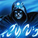
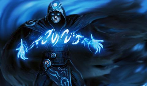
This is a MTG card called Jace The Mind Sculptor.
This is a MTG card called Jace The Mind Sculptor.
@Nathan Drake
I used SOME lighting and color blending in this one... I didn't think text would fit if I used it so I didn't put any in... So here's one of Linus:

WITH Text:
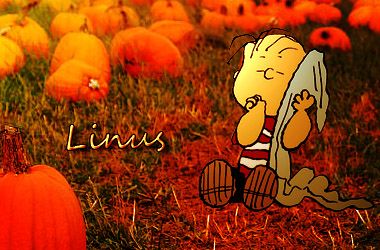
I actually really like that. See if you take the burn tool and use it on an applied image you could add a shadow to that cartoon character from charlie brown and youd get amazing depth on it. Or you could use a black brush on a lower oppacity to create the shadow. six and half a dozen. The sig already has depth cuz its very well blurred. A shadow would make it even better.
Your pretty good for a newer GFXr. You should read lots of tuts and i reckon youd be one of them who improves so fast.
Join sigresource.com gfxresource.com and fringefx so you can pinch their resources. they have some of the best stuff

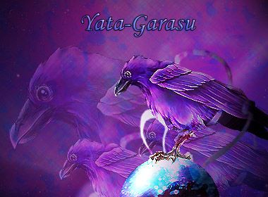
Wow Alex, you're getting better and better every time! I really like that purple one. The set is really nice too! Keep going dude! You're doing great with these! ")