[29/11] Lightning is set to return to the media spotlight in December

Status
Not open for further replies.

C i d

Dark Knight
Veteran
Joined
Jun 9, 2010
Messages
2,286
Gil
0
LR-Logo.jpg


While we received no update yesterday from the Lightning Returns team, they’ve made up for it today by continuing their last little bit of review.


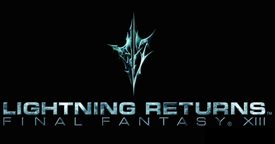
The marketing team admits that the current amount of information out there is quite insufficient, but promises to open the floodgates come December. Given that the official LRFFXIII Twitter and Facebook pages have ramped up in activity over the past two weeks, it only makes sense that they would confirm as such. That said, today’s recap topic focuses on the game’s new logo.


The team really wanted to make a new logo for the game – something completely different. The idea was to draw up this logo from scratch and create something different from the usual Amano outing. They went through several designs, all of which were eventually scrapped. Finally, the end result was born out of two concepts: “lightning” and “metallic.” In fact, the symbol used in the logo will appear at some point in the game.


What do you think of the new design? Do you prefer the classic Final Fantasy style logos?


Source: Nova Crystallis
 
Talk is cheap, marketing team. Put your endless supply of money where your mouth is, for a change, rather than up your arse...although I suspect you could stick it in either place when talking about this game and the result would be much the same thing. But who knows. At least they've admitted that there is a severe lack of information on this game right now. But will we get actual gameplay and story information - you know, stuff that matters - or just more bullshit about the graphics and engine it's running off, etc?

The thinking behind the logo is, predictably, as bad as the logo itself. They seem to have put very little thought into it, and it's a far cry from the elegant logos that the FF games have had in the past. Even XIII-2 had a decent logo, and that was an awful, AWFUL game. The symbol appearing at some point in the game is not unusual in itself: this has happened in pretty much every Final Fantasy game. That's why these things are a part of the logo; they represent a core part of the game. Squall embracing Rinoa for FFVIII, for example. It's nothing new; if they want to justify a new logo design, then they're going to need to come up with better than that. If anything, this open admittance is even WORSE than what is normal, because at times it's been far more subtle: the logo image for FFXIII, for example, didn't appear until the end of the game, and whilst it was blatantly obvious what it was, it was still far more subtle and less contrived than this sounds. It's all well and good to have a symbol in a logo that means something, but it's better to have it symbolic or subtle, rather than blatantly obvious and obnoxiously waved in your face.

So, in summary?

KJBIa.gif
 
Status
Not open for further replies.
Back
Top