Yumiko's Graphics Dump (*warning* very image heavy >.<)


:wacky: It made me giggle, cause it sounds like me. xD

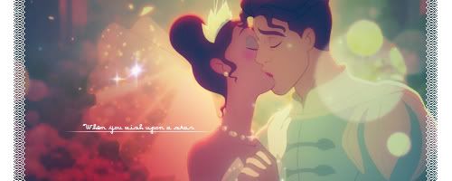
I really liked the second version better. Even though, I preferred the more vibrant colours in the first one, I didn't really like the brush you used, tleast I think it was a brush, under the text, the splatters. It looked kinda out of place, if you know what I mean.

I'm adoring your borders. They're always really rebelious and out there. xD I really like that.
 
Thanks! (・w・)

This one is from the last SOTW. Unfortunately, I submitted the wrong version. I had two versions - one a color test (because my photoshop's been retarded with keeping its colors), and two the one I was going to submit.

This is the one that was supposed to be submitted:

princessnfrog1.jpg


Aaaand, this is the test one that got submitted (^◇^;) :

princessnfrogwhite.jpg


/fail

again, C&C is welcome

Ooh, if you could make a combination of the two, it would be the flawless signature. Both are really pretty! I thought the second one was really good, but then I love the vibrant colours in the first one. I have to agree with Kira though, that splatter brush seems a little out of place. I think I prefer the border in the first one too, although, I love how you experiment with borders instead of just slapping on a basic stroke, it really makes your works unique ^^
 
Thanks guys!

I see what you guys are saying about the splatter - yes it is a brush. I went against myself and used a premade brush (*´д`*)

Kind of this fun self-challenge I have by avoiding premade brushes and using custom self-made ones. Ψ(`∇´)Ψ But yeah now that I look at the brush I added onto the sig, it doesn't really fit in with the overall theme of the signature.

Anyways, here's my entry to last week's SOTW

ganguro4.png


It was supposed to be a vertical sig, and sadly I thought the 500x200 restriction meant it could be switched (^◇^;) silly me. So I had to flip it over, and it ended up looking kinda wonky.

Anyways, I'm obsessed with the gal fashion in Japan (I HATE the obsession... the prices of overseas clothing should NOT be legal... but... I love the clothes and style...) as well as the crazy cell phone decorating, and that was my inspiration for the sig~
 
I see what you guys are saying about the splatter - yes it is a brush. I went against myself and used a premade brush (*´д`*)

:lew: I'm not a big brush fan myself, but a brush every now and again is actually a nice way of changing things up. =) Just gotta find the right brushes, and you can make some really nice effects/add-ons to your signatures with them. I like a brush every now and again, personally, even though I hated them for a long while. xD

Shame you couldn't enter with a vertical sig, it works a lot better this way I think. Most likely 'cause it was intended to look like that.

Gorgeous colours, and I like the bright touches on the focal point. Original border, again. =)
 
:lew: I'm not a big brush fan myself, but a brush every now and again is actually a nice way of changing things up. =) Just gotta find the right brushes, and you can make some really nice effects/add-ons to your signatures with them. I like a brush every now and again, personally, even though I hated them for a long while. xD

Too true too true. I think I was so caught up on "DON'T USE THAT BRUSH, KID!" that I totally forgot the effect it has when used to add a bit of that magic. It was also fun making them, but it totally made me neglect the ones I did have. So I took your words to heart, and decided to look through my brushes, teehee, and make my blog banner:

stepone3.png


C&C ❤

 
I love your LPs!~
Your siggies are okay imo, I think you should try incorporate more flow into them. Allow the effects to run smooth and lead your eye to the focal point.


Ah it does look a lot better vertically. I liked this A LOT in the SOTW, it's so creative and I love that keychain ahhhh I want iiiit. xD The only thing I think gets in the way of it is the text placement, it's kind of obtrusive imho, but other than that it's a pretty sick piece.

Anyways, I'm obsessed with the gal fashion in Japan (I HATE the obsession... the prices of overseas clothing should NOT be legal... but... I love the clothes and style...) as well as the crazy cell phone decorating, and that was my inspiration for the sig~

I usually buy clothes that resemble Japanese trends so I don't have to pay all that money. x_x Then I put em together with accessories in a way that looks good. It's my rule to nevaa forget the power of a nice belt and kneesocks. xD
 
Ah it does look a lot better vertically. I liked this A LOT in the SOTW, it's so creative and I love that keychain ahhhh I want iiiit. xD The only thing I think gets in the way of it is the text placement, it's kind of obtrusive imho, but other than that it's a pretty sick piece.

Which text? I have two texts in there, the ギャル text as well as the text that runs in through the middle of the sig.


I usually buy clothes that resemble Japanese trends so I don't have to pay all that money. x_x Then I put em together with accessories in a way that looks good. It's my rule to nevaa forget the power of a nice belt and kneesocks. xD

But but but I haven't seen anything here that resembles the styles I fancy (they may have the plain concept down, but I haven't seen much similar to my taste (*゜―゜) ). I lean towards Rock/ agejo style with stuff from Ma*rs, One Spo, Golds Infinity, Gilfy, Glad News, and all that awesome stuff.
(⌒~⌒;) I can dream... I can dream...

Accessories though, I totally stock on my accessories here ❤ So I don't have much of a problem with accessories. I should probably take this convo elsewhere... (^◇^;)

*ahem* back on topic. Thankies for your opinion! Yeah, my sigs tend to have a lot more going than the usual sig, and it's usually because I have so many ideas and little things I want to put in there. Perhaps I could tone it down a bit. This is why I do better with large pieces (=∇=;|||) there's just so much more space to convey the theme and meaning. Then again... I suppose that is the challenge with sigs... conveying theme and meaning effectively in such a small space.
 

This is very cute

I love the use of colour and the little spots throughout the signature.

I like the small font you used over on the left side too and the angle you have it on. It's very cute. <3

I like how you've broken up the piece with random brushes and such as well.

It looks very creative and spruces it up.

Very nice work.

Hope to see more from you soon!
 
Back
Top