This is where the SotW Winners will be posted. Feel free to add your congratulations to the winner, but that's it. All other posts about SotW should go in the discussion thread.
SotW # 1: Final Fantasy
<?xml:namespace prefix = o ns = "urn:schemas-microsoft-com fficeffice" /><o></o>

<o></o>
Winner: Andromeda
<o></o>

<o></o>
+ Brilliant, bright shade of blue
+ Excellent brushwork for the background
+ Great job with the image blending
-The text ‘Andromeda’ is far too small
-Slightly empty towards the left of the image
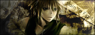
2<SUP>nd</SUP> Place: Tidus Blade

+ Colour scheme is nicely suited to the render
+ Simple and striking
+ Nice brushwork
-Brushwork goes over the face of the render – erase that")
-Text is slightly too bright
3<SUP>rd</SUP> Place: kairi12

+ Very calm and tranquil colours, nicely suited
+ Good job on blending the two images together
- Too light on the left
- More brushwork is needed for added effect
Great job guys
SotW # 1: Final Fantasy
<?xml:namespace prefix = o ns = "urn:schemas-microsoft-com
fficeffice" /><o></o>
<o
></o>Winner: Andromeda
<o
></o>
<o
></o>+ Brilliant, bright shade of blue
+ Excellent brushwork for the background
+ Great job with the image blending
-The text ‘Andromeda’ is far too small
-Slightly empty towards the left of the image
2<SUP>nd</SUP> Place: Tidus Blade
+ Colour scheme is nicely suited to the render
+ Simple and striking
+ Nice brushwork
-Brushwork goes over the face of the render – erase that
-Text is slightly too bright
3<SUP>rd</SUP> Place: kairi12
+ Very calm and tranquil colours, nicely suited
+ Good job on blending the two images together
- Too light on the left
- More brushwork is needed for added effect
Great job guys


")


