I actually acquired it around the same time as Mark and the others, but I never got around to actually broadcasting much of my work. I haven't really managed to get passed using brushes, so I'm still learning quite a lot. All tips, hints and advice are totally welcome, but don't bash on the early attempts too much 
#1.

I had absolutely no idea what I was doing here, the tutorials I was listening to were absolutely pathetic ... so I ended up taking a brush and, literally, just scribbling.
#2.

I was just starting to familiarise myself with various techniques with this one - you can all agree it was a massive improvement from the first one.
#3.

I had now learned how to download brushes and experiment with blending a little more, but it still wasn't the best of attempts.
#4.

This was actually more of a back-step, I thought ... although I was finally getting the hang of using layers.
#5.

This is my group of friends and I ... I was, again, just experimenting with layers and blending. I hadn't really improved much by this point.
#6.

I thought that this one was, indeed, my masterpiece at that current time. I'd finally mastered how to use brushes correctly and, again, I was just experimenting with blending options and whatnot.
#7.
http://img443.imageshack.us/img443/8963/attempt7ffhiy3.jpg
This was a banner for FFH I created, which has actually ended up on my spam boards I started (hence the reason I've left it as a link; I hate stretched pages). I thought this was rather snazzy, myself.
#8.

#6 was quickly overtaken by this as my masterpiece at the time.
#9.

...and then #8 was replaced even more quickly with this (which was the first I labelled, as I know people tend to get their work stolen - not that anybody would steal my god-awful work).
#10.
http://img443.imageshack.us/img443/449/attempt12rinoawallpapertg0.jpg
This time, I went for a wallpaper - again, it's too big for this forum skin, so I'll leave it as a link. I currently have this as my desktop background and I can honestly say I think it looks GOOD.
#11.

Last creation for you all [: I thought this was actually pretty decent as well!
It's evident I'm still learning new things all of the time ... but I'd really appreciate some advice on what else I can do, and how to do it!
EDIT:
Here's my latest creation:

EDIT II:
Here's a few updates on things I've not posted yet.

This was a quick birthday invitation, which I made for the various people invited to my 16th. It's not entirely creative, but it was something to do.

This was a signature I made a fair while ago, actually, for the PC Strategy game, Starcraft. I was quite proud of this one.
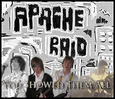
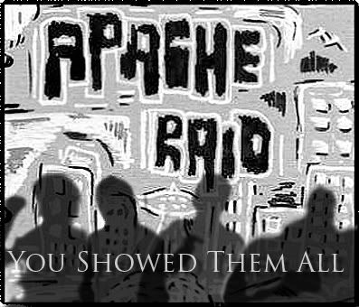
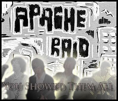
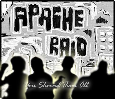
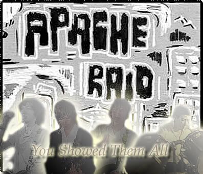
This was the first time I'd tried to use real people with some kind of skill. This is my band and I [on the drums]. I was simply looking to try something as a kind of prototype album cover. The design in the background was hand-drawn by Nick, second from the left.

I do believe that this is my best work so far.
------------------------
So, after 7 months of being out of the loop with Photoshop, Mark helped me to re-acquire it and I've been improving again.

So, the render was provided in a competition for the Clans and this was the best I could come up with - it's supposed to be Jean Grey from the X-Men, in Manga form. Anime is disgusting to work with. =(

This was another challenge, SorceressEdea7 set this one for me. Again, I hate working with Anime. xD

So, I finally learned how to use C4D's and managed to come out with this, with the help of a tutorial. After a bit of criticism, I improved the clarity of the focal point and produced this:

This is my current sig and I think it's bloody good.
As always, all comments/criticism are welcome.
One final version of the above signature:

Much better.

#1.

I had absolutely no idea what I was doing here, the tutorials I was listening to were absolutely pathetic ... so I ended up taking a brush and, literally, just scribbling.
#2.

I was just starting to familiarise myself with various techniques with this one - you can all agree it was a massive improvement from the first one.
#3.

I had now learned how to download brushes and experiment with blending a little more, but it still wasn't the best of attempts.
#4.

This was actually more of a back-step, I thought ... although I was finally getting the hang of using layers.
#5.

This is my group of friends and I ... I was, again, just experimenting with layers and blending. I hadn't really improved much by this point.
#6.

I thought that this one was, indeed, my masterpiece at that current time. I'd finally mastered how to use brushes correctly and, again, I was just experimenting with blending options and whatnot.
#7.
http://img443.imageshack.us/img443/8963/attempt7ffhiy3.jpg
This was a banner for FFH I created, which has actually ended up on my spam boards I started (hence the reason I've left it as a link; I hate stretched pages). I thought this was rather snazzy, myself.
#8.

#6 was quickly overtaken by this as my masterpiece at the time.
#9.

...and then #8 was replaced even more quickly with this (which was the first I labelled, as I know people tend to get their work stolen - not that anybody would steal my god-awful work).
#10.
http://img443.imageshack.us/img443/449/attempt12rinoawallpapertg0.jpg
This time, I went for a wallpaper - again, it's too big for this forum skin, so I'll leave it as a link. I currently have this as my desktop background and I can honestly say I think it looks GOOD.
#11.

Last creation for you all [: I thought this was actually pretty decent as well!
It's evident I'm still learning new things all of the time ... but I'd really appreciate some advice on what else I can do, and how to do it!
EDIT:
Here's my latest creation:

EDIT II:
Here's a few updates on things I've not posted yet.

This was a quick birthday invitation, which I made for the various people invited to my 16th. It's not entirely creative, but it was something to do.

This was a signature I made a fair while ago, actually, for the PC Strategy game, Starcraft. I was quite proud of this one.


This was the first time I'd tried to use real people with some kind of skill. This is my band and I [on the drums]. I was simply looking to try something as a kind of prototype album cover. The design in the background was hand-drawn by Nick, second from the left.

I do believe that this is my best work so far.
------------------------
So, after 7 months of being out of the loop with Photoshop, Mark helped me to re-acquire it and I've been improving again.


So, the render was provided in a competition for the Clans and this was the best I could come up with - it's supposed to be Jean Grey from the X-Men, in Manga form. Anime is disgusting to work with. =(

This was another challenge, SorceressEdea7 set this one for me. Again, I hate working with Anime. xD

So, I finally learned how to use C4D's and managed to come out with this, with the help of a tutorial. After a bit of criticism, I improved the clarity of the focal point and produced this:

This is my current sig and I think it's bloody good.

As always, all comments/criticism are welcome.
One final version of the above signature:

Much better.


