Navigation
Install the app
How to install the app on iOS
Follow along with the video below to see how to install our site as a web app on your home screen.
Note: This feature may not be available in some browsers.
More options
You are using an out of date browser. It may not display this or other websites correctly.
You should upgrade or use an alternative browser.
You should upgrade or use an alternative browser.
Opinion
- Thread starter Morrigan
- Start date
- Tagged users None
Eidolon
Guru
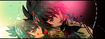
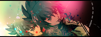
Can't exactly point out where the obvious differences are, but I prefer V1 because I like the higher contrast.
Nice job!
Nice job!
The first one for me, for the same reason. Contrast looks better. At least, to me that is. 
M
Meikyousisui
Me to i also like the first one cause it has better contrast than the other one I don't really like dark sig's for ome reason.
Thx for the sig Sakura.
Love You.
Thx for the sig Sakura.
Love You.
Demaian
Disturbingly Beautiful
I don't know about you other guys, but I like the second one better. Why? Just within reason in my opinion, the lighting and the colors seem to flow better, especially with the green. The dotted lines on the right seem kinda out of place though. I'm really liking those colors and I believe you've improved a lot last time I saw you.
EDIT: I'd also like to apologize for not being able to give you the request you had asked for long ago.
EDIT: I'd also like to apologize for not being able to give you the request you had asked for long ago.
Last edited:
Demaian
Disturbingly Beautiful
First one cause of the contrast. The second one just makes it too monotone and bright. The renders are good and match the BG well. 9/10
Neither of those tags is monotone. Why? Because monotone would be one color with variying tints (diluted in white) and shades (diluted in black) thus the shadows and highlights of a single color mixed with either black or white.
Both tags clearly have more than a single color, they have hues.
you're correct. I tend to use a lot of words out of context. Contrast was the better word. Plus, when i said monotone, I meant that it was becoming very light, bright, and soft. I was just using monotone as a blanket term to say that its losing a lot of "stuff" and becoming "monotonous"
but I can see what you mean, so I take back what I said above.
but I can see what you mean, so I take back what I said above.
Well,you didn't had to apologize about that.It's ok that you didn't make it.I don't know about you other guys, but I like the second one better. Why? Just within reason in my opinion, the lighting and the colors seem to flow better, especially with the green. The dotted lines on the right seem kinda out of place though. I'm really liking those colors and I believe you've improved a lot last time I saw you.
EDIT: I'd also like to apologize for not being able to give you the request you had asked for long ago.
Anyway,what are your opinions about my current one?
Eidolon
Guru
Anyway,what are your opinions about my current one?
I really like the colours and design, but (this is just me nitpicking) I don't like how the render is cartoony and the rest of the sig is very GFX.
I'm choosy - I like a cartoony BG to go with a Cartoony render, and a CGFX BG to go with a CGFX render
Demaian
Disturbingly Beautiful
Well,you didn't had to apologize about that.It's ok that you didn't make it.
Anyway,what are your opinions about my current one?
Ah ok.
As for your current, I'm totally over it, that thang, right dhurr, is EYE-CANDY. Your color theory is superb in that tag. I love all the colors. I like how her green eyes and that pink hair do that contrast clash with each other. Its delicious enough to eat. I can taste the sugar now.